Note: See Painting Materials for detailed description of materials required for oil or acrylic painting. See Stretch Canvas for instructions on choosing canvas type, or stretching your own canvas.
Basic Materials Required:(Note: For differences between oil and acrylic, see FAQ)
- SeeCanvas (panel, pre-stretched/pre-primed canvas, or stretched and primed canvas), or other
support (size ranging from around 8" x 10" to 16" x 20")
- Oil, or acrylic paints (37 ml tubes for most colors; may use 120 ml for white):
Colors needed for this lesson:
Titanium White
Blue-black (brand name Winsor & Newton; Payne's Gray can be substituted)
Yellow Ochre
Venetian Red (or Red Earth)
The following colors can be substituted (so that there is a red, yellow, white, and blue or black):
Cobalt* or Ultramarine Blue* (for Blue-black)
Winsor Red (made by Winsor & Newton) or Cadmium Red (for Venetian Red)
Winsor Yellow (made by Winsor & Newton) or Cadmium Yellow (for Yellow Ochre)
* If Cobalt or Ultramarine Blue are substituted for Blue-black or Payne's Gray, also get Ivory Black)
- Brushes: Oil or acrylic bristle or sable/synthetic paint brushes (I suggest a #4 or #6 round, #8 flat or #8
bright, and #6 or #8 filbert (optional)) (See Painting: Materials for more info about brushes)
- Mediums for oil paint: Small bottles of Refined Linseed Oil and Distilled Turpentine (not the kind of
turpentine used to clean brushes, that comes in a big metal container) (For acrylic paints, water is the
medium; plus any additives, such as extender (to extend drying time))
- Palette (either wooden, glass, metal, plastic, or a pad of disposable palette paper - I recommend the
paper palette - no cleanup!)
- Palette knife (small, for mixing paint), and painting knife (to paint with, if desired)
- Container to hold painting medium: Metal cup(s) commercially sold, or small jar (I use baby food
jars)
- Lint-free rag for clean-up
- Standing or Table Easel (optional) (If you don't have an easel, you can lean your painting against the
table on which you have your still life.)
- Still life materials: Fruit, vegetables, bottles, bowls, plants, decorative gourds, figurines, flowers, etc.
(Some fruits and fresh flowers only last a brief time; I would try to use fruits such as apples, lemons
or pears, and potted flowering plants, such as mums, for this lesson, since they last a little longer.)
Lesson:
Centuries ago, painters would sometimes use a "limited" palette of four or so colors - blue-black, venetian red, yellow ochre, and white. This practice continued for some traditional painters and students until the 20th century, with color variations. These palettes contain versions of the three primary colors - red, yellow and blue (from which most basic colors can be mixed), plus white (and also black, if a blue different from blue-black is used). The practice of limiting the color palette teaches how to mix basic colors, and also helps the beginning painter achieve a unified image more easily than if he/she used a wider variety of colors. With less choices to make, and simplified relationships, it is easier to see relationships of color, and value, in a painting, providing a good learning experience for the student.
- You can sketch your still life first, on paper (with pencil or charcoal), or on the canvas, with vine
charcoal, or sketch it in with your round, flat/bright, or filbert brushes. Don't use pencil on a stretched
canvas - it will make a dent in the fabric. If you use charcoal on the canvas, use just a little and do it
lightly - it can mix with the paint and make the paint 'muddy.'
- Try to paint with a good light source; I prefer natural light, coming from behind or beside you,
which shines on the objects, showing lights and darks to reveal their three-dimensional form. With
natural light, you can also best ascertain the colors of the objects.
- Establish the large shapes and masses first, and their position on the canvas. Save detail for last.
- You can work tentatively, slowly, at first, and gradually arrive at the shape and placement of your
composition, if that makes you feel more comfortable - there is no need to hurry.
- When painting objects, try to discern their underlying geometric shape - an apple is a sphere, a
bottle is a cylinder, a bowl is a half-sphere. Usually, objects are seen from slightly above, turning a
circular plate into an ellipse. Try to "forget" what the objects are - just look at their forms/shapes.
- Work on the whole composition, rather than lingering in particular areas, from the general to the
particular.
- In order to help integrate the objects and the space around them, try using a simple colored or
patterned fabric, placemat, etc. under them.
- Before starting to paint, spend some quality time looking at your subject - its overall shape (circle,
triangle, etc.), color, and values (lights and darks).
- Notice that usually, objects and surfaces are not all one color - there are shadows and highlights
on them which cause variations of their "local," or actual color.
- Don't try to capture too much detail - just try to suggest textures, details, etc.
- You can start with the lighter and medium tones first, and work your way up to the darks; this is
easier in terms of being able to cover up areas later. After you have more painting experience, you
can choose what order works best for you.
- I recommend beginning by looking to see what tones are in your subjects - lights, darks, and
middle tones - before concentrating on their colors. With the traditional limited palette of colors,
you will probably not be able to "match" all of the colors in your subject; just try to approximate
the value and color as best you can.
- IMPORTANT: The best way to apply paint to a canvas is "fat over lean." This means that the
thinner layers of paint should be applied first, gradually thickening the paint layers as you go, so
that the top layer is the least thinned with medium.
- Using more than one brush, with one for whites and yellows, one for reds and purples, one for
blues and black, etc., will help keep your colors from getting "muddy," a common problem for
beginning students. Also, try not to load your brush with too much paint.
- If the color on your canvas becomes "muddy," and unworkable, you can either scrape the paint
off with your palette knife, wipe it with a rag, or wait 2 or 3 days for the paint to dry, and dive in
again.
- Round brushes are good for line and detail work; flats or brights are good for larger areas, and
sharp edges; filberts can do all of the above, but are generally useful for larger areas, with softer
edges.
- Palettes and paper palettes come in different colors - mostly white or neutral gray for paper
palettes. Colors are affected greatly by other colors around them - so paint colors will look
different on white than on neutral gray palette paper. I prefer white, but some artists want a neutral
gray. What this means is that if you are mixing a color on your palette, and your palette is a
different color than your canvas, the color you are mixing will probably look different on the
canvas than on the palette. If you are looking for a certain color or value, you will need to either have
the palette be the same color as your blank canvas, or put some of your mixed color on your palette
knife and hold the knife against the canvas to see how the color will look in your painting.
- Whether on an easel or on your lap, try to keep the painting almost vertical in front of you, rather
than at an angle away from you, so you can see the whole painting straight on while working.
- If you are placing your canvas on a standing easel, place it so that your eye level is a little higher
than the vertical halfway mark of the canvas.
- If you have trouble opening your paint tubes, you can try one of those rubber gripper
can-opening things - or, you can first put the tube and lid under hot running water for a few
minutes. Sometimes small pliers work to get a top off. Don't try to force the tube open without
doing these two things - the tube can break if twisted hard, and if that happens, your paint will dry
out.
- A painting session can last anywhere from 2 to 6 or 7 hours; generally 3 or 4 is a good amount of
time. If you use long-lasting still life materials, and have the space to leave the objects there until
the painting is finished, you can take your time to finish. Paintings often are enriched by multiple
sessions, and different perspectives; and certainly not rushing the work and studying the forms
over time can only help. Sometimes, though, you may finish in one session - if those alpha waves
are really revved up!
Color:
The three primary colors are red, blue and yellow; in theory, all other colors can be mixed from these. Two of these together will make a secondary color: red and blue make purple; blue and yellow make green; and yellow and red make orange. On the color wheel, complementary colors are opposite one another: blue versus orange; yellow versus purple; and red versus green. This means that red and green, yellow and purple, and blue and orange, when next to one another, will make each other look brighter, more intense. When mixed together, however, complementary colors form a neutral color (neither warm nor cool), like tan, gray, etc. Adding a small amount of a complementary will make a color less intense. Adding earth colors like yellow ochre, burnt siena, burnt umber, raw umber, etc. make your colors more natural, as opposed to manmade, "bright," colors. The fewer colors mixed together, the brighter the resulting color will be; the more colors that are added, the duller the mix will be. A tint is a color mixed with white; a shade is a color mixed with black; forming lighter and darker colors, respectively. Mixing white or black also "grays" out a color, making it less intense. Colors of nearby families are more harmonious, e.g., red, violet, and orange, or blue, green and yellow-green. Colors can be warm, cool or neutral; cool colors tend to have more blue; warm colors tend to have more yellow in them; for instance, a yellow-green will be warm; a purplish-blue will be cool. Neutral colors are neither warm nor cool. Shadows are thought to contain more cool colors; highlights to contain more warm colors. (Warm colors are said to come forward, cool colors to recede in space.) However, color is a complex and unpredictable element; the best way is to go case by case, because colors change dramatically depending on what colors are placed next to them, appearing warm next to one color, cool next to another, etc. In fact, the whole area of color relationships is very complex - every hue, every value, etc. affecting every other, mathematically a very large number, even in a simple painting. Experience will train the eye to be sensitive to color, and color relationships. For more info on color, see Color Mixing.
Setting up:
On your palette, you can squeeze out what you think you'll use for this session (I am very stingy - paint costs money!) You can always squeeze out more later. After looking at your subject, decide which colors you will need. Blue-black will take care of your need for blue (mixed with white); and your darks (it is almost black in the tube); yellow ochre mixed with white will give you your yellows; yellow ochre mixed with red gives orange; yellow ochre mixed with blue-black gives olive green; venetian red mixed with blue-black will give purple; white will lighten everything. If you are using the alternative palette listed above, your Winsor Red, Winsor Yellow, Cobalt or Ultramarine Blue, etc. will be much brighter than the traditional palette of blue-black, venetian red, yellow ochre, etc. There, blue and yellow will make a bright green; cadmium yellow and cadmium red together will make a bright orange; ivory black and yellow will make an acidic green; cadmium red and ultramarine blue will make a brighter purple, etc.
Mediums for Oil painting: To mix your painting medium, pour a little (half-inch) of refined linseed oil into your metal container or bottle; add a little distilled turpentine. If you want a thinner medium, for beginning a painting, try a mix of 65-75% linseed oil and 25-35% distilled turpentine. For a little thicker medium, try 85% oil with 15% distilled turpentine. Roll the mixture around to mix the two liquids together. Put the brush into the medium to wet it, and wipe off excess against the lip of the jar. After mixing the color you want with the palette knife, dip the brush into your color (not too much), and you can either sketch in your subject, or start painting, reloading the brush when dry; I re-dip the brush into the medium mixture if needed. (Generally, not too much medium is used in oil painting.) Some pigments are very strong - venetian red, for one; just a tiny dab will overpower everything; others are very weak, like cerulean blue. Some colors are also thicker and drier than others (needing more medium), and also vary with manufacturer.
Mediums for Acrylic Paints: Water is used as the medium, with any desired additives, such as extender or retarder, which will keep the acrylic paints from drying so quickly.
Approaching the Canvas:
Try not to think about style or technique; just try to study the objects in front of you and render their three-dimensional forms, their values (lights and darks), and colors. Try to enjoy the experience: like the boxer before he goes into the ring, psyche yourself into an alpha state - play non-intrusive, inspiring music; try to be physically and mentally relaxed, not afraid. This is one of the few places in life where, if you make a "mistake," no one gets hurt. And in art, "mistakes" often teach valuable lessons, or even lead to wonderful discoveries. The purpose is not perfection - it is learning, and self-expression. Be free to experiment, take chances.
Painting is not the same as drawing - it is not filling in the outlines of shapes with color. Contours can be used in painting, but painting is more concerned with areas, or masses of color than with line. The directions of your paint strokes become important in the overall composition; they contribute to the visual, or directional movement caused by lines, shapes, patterns, and repetitions of your forms throughout the composition. Try to be aware of these movements, and orchestrate them to the advantage of the design. Try not to let the movement through the composition get stuck anywhere; or leave the picture area (go off the edge) without bringing the viewer's eye back in nearby. Fore more info on composition, see Design III and Design IV.
Basic Design Concepts:
The picture surface of the canvas is equally important in all areas; there is not just an object and an unimportant background. The subject/object of a painting can be called the figure; the space around it is the ground (usually called the background). Figure and ground are equally important in a painting. These can also be called positive (figure) and negative (ground) space; in other words, the space around a figure/object is as important as the figure/object. It is one continuous area, to be divided into compositional areas. The placement of the figure/object is important; to just plop it down in the middle of the painting is a no-no! Also, its relationship to the edges of the painting is important - does it touch the edges? Is it placed so there is a dynamic relationship to the edges? Are the objects placed so that there is balance of left and right, top and bottom, without being too symmetrical (and boring)? An asymmetrical balance is the ideal: instead of identical bottles, one on the left and one on the right, there can be one large bottle on the left, and two smaller on the right to balance the composition. Generally, the "weight" of the image should be more on the bottom than the top - larger objects or areas near the bottom, smaller near the top - however, this is not a hard and fast rule, this is just a guideline, to be broken when necessary.
Clean-up:
When finished (oil painting), wipe the excess paint from the brushes with a lint-free rag; dip brush into either distilled turpentine or regular, brush-cleaning turpentine, and wipe again. Brushes can be cleaned with various commercial products available at an art supply store; I have been using The Masters brush and hand cleaner, with lukewarm water; rub the brush lightly into the cleaner, and rub against the palm of your hand, then rinse; do this several times until you are sure no paint remains on the brush, including down by the ferrule (the metal part). Rinse the brush, and wipe lightly against a towel to dry; while still moist, shape the brush into its original shape with your fingers, and leave either standing, brush end up, or lying flat with the brush end extending beyond the table edge, so that the brush end does not touch any surface.
Clean-up for acrylic paints is regular hand soap (but not anything oily like Dove) and lukewarm water.
Finally, a quote from the Impressionist painter, Claude Monet; it was written about landscape painting, but it can also be applied to any kind of painting:
"When you go out to paint, try to forget what objects you have in front of you, a tree, a field. Merely think, here is a little square of blue, here an oblong of pink, here a streak of yellow, and paint it just as it looks to you, the exact color and shape, until it gives your own naive impression of the scene."
This advice may not extend to all the painting you will ever do - but it is a good beginning, a way to discard our visual preconceptions and roadblocks. It allows a student to see forms abstractly, for their shape, value and color alone, regardless of their identity in the world, and this is a very important first step to SEEING. Once you learn to see, you can follow your own path, into something more substantial than mere appearances.
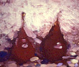
Red Pears, oil on canvas - In this painting, the paint has been applied rather thickly, and brushstrokes are evident.
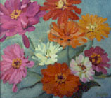
Zinnias, oil on canvas - Flowers are good to paint, but many kinds only last a short time, meaning that you need to finish a painting in one or two sessions.
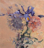
Iris and Carnation, oil on canvas - A simple painting of two flowers, with a shadow on the left. The composition forms the letter 't,' slightly off-center.
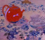
Red Teapot, oil on canvas - Using a patterned tablecloth under the objects allows the image to cover most of the picture surface, therefore interacting with the edges of the canvas.
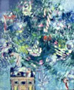
Christmas Tree, oil on canvas - A painting of glass ornaments and ceramic house, painted as touches of colored lights and reflections.
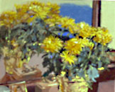
Mum Plant, oil on canvas - Here I put the flowering mum in front of a mirror, which brought a double image to the composition, and a sense of spatial depth.
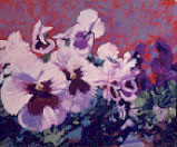
Red Pansies, oil on canvas - If red is used in the composition (here in the background, or negative space), the color relationships are brought to a higher key.
I recommend setting up a small still life for a beginning painting exercise - and doing many of these - for the beginning painter. Just a few objects is good - simple, interesting shapes to work with. For some examples: two pears in a small bowl; two or three pears on a table; a pear and an apple with a small object, such as a figurine or pitcher; flowers in a vase (ones that live for at least a few days are best); a simple plant with a small object; two or three decorative gourds; a small bottle, with a different-shaped natural object, such as a pine cone; a couple of onions and a small knife; a small potted plant with a smaller object; a small eggplant and a lemon; two or three fruits or vegetables on a small plate, etc. Look at still life paintings by Chardin, Cezanne, late Manet small flower paintings (1875 and after), Giorgio Morandi, Henri Matisse, 17th century Dutch still lifes, Janet Fish, Pierre Bonnard, Berthe Morisot and Henri Fantin-Latour for ideas. Arrange your objects so that they are placed well on your picture surface (surface and shape of canvas), utilizing the picture surface well and having the forms relate to the outside edges of the canvas. Before you start painting, spend some time looking at your still life, studying the tonal values, the colors, and the negative spaces between and around the objects, thinking about what colors and values predominate, as well as collective and individual shapes. How can you visually connect your objects and the space around them? Are there colors common to all? Or common tones (lights and darks)? What overall shape do they form? Can you use what's around the objects - a colored or patterned surface, such as a tablecloth, etc.