Choice of: (See Descriptions section below for detailed information)
Pastel pencils (usually come in sets)
Soft pastels (come individually or in sets; brand names include Grumbacher, Sennelier)
Hard pastels (come individually or in sets; Rembrandt is one brand name)
Note: Pastel materials tend to be expensive; buying a set of between 20-36 sticks of color will save a little money over the larger sets, and sometimes these sets go on sale, for instance at www.dickblick.com or utrechtart.com. Pastel papers are also expensive, $1 or more per 18"x24" sheet; but the colors are beautiful, and so is the paper. I have also used regular Strathmore drawing-quality (as opposed to sketching) paper for pastels; this is a smooth surface, but I found it worked nicely, and is cheaper (it comes in pads of up to 18"x24").
Note: Oil pastels are a somewhat different medium than the above-listed materials, and are not covered in this lesson. (They are more like crayons - hard, and not as blendable as regular pastels.)
Descriptions of Pastel Types:
Pastel pencils - These usually come as large sets of 24 or more, and are good for more detailed work; however, sets can be expensive. Soft and hard pastel sticks, on the other hand, are better for looser work, like Degas or other impressionistic style.
Soft pastel sticks - These come individually or in sets of 10 to 200+; sets are usually cheaper than buying individual sticks. Unlike oil paints, where you can do with under a dozen tube colors, pastels cannot be mixed together, only on the paper (in overlapping marks). This means that you really need to have more than ten colors. If you can afford a lot more, great. If you can't, I would suggest getting a box of 10 or 24, and perhaps buying single sticks, one or two at a time until you have the colors you need. Pastel sticks come as full- (about 2-1/2") or half-size (about 1-1/2") sticks in a set; and come in rounded and block form. Sometimes, sets contain a general assortment; but there are also sets available for specific needs, such as landscape or portrait assortments. Landscape assortments contain more earth colors, greens, etc., and portrait assortments will contain various flesh colors, etc. Individually, pastel sticks sell for about $1-2 a 2-1/2" stick, in a large variety of shades. Soft pastels are more commonly available than hard pastels; soft pastels are generally what come in a common box labeled 'pastels.' But, differences still exist among brands, and even among pigments, so there is still a range of what is considered 'soft'. The really soft, which Grumbacher usually makes, spread their color more easily, and can be re-worked and layered easily. (I actually find Grumbacher one of the best pastel makers for this reason, though they are usually cheaper.) Rembrandt pastels are also good, but tend to be a little harder, and are sometimes harder to re-work or leave the color on the paper.
Hard pastels - To tell the truth, I haven't seen hard pastels for sale in a long time, and perhaps they are not as readily available as they once were. The set I have, which has about 25 pastel sticks, is probably from the 1940's, and has thin, rectangular pieces which are much harder than soft pastels, good for line and more detailed work. Some of today's brands are harder than others, e.g. Rembrandt.
Lesson
Pastels are great to use - they offer the best of both painting and drawing. They offer the color of painting, but are a more spontaneous medium, and more portable for working outside. They have the immediacy of drawing, combined with the richness of working in color. This directness offers amazing possibilities for experimentation, personal expression, and doing studies or finished works which are much quicker than painting with oils or even acrylics, and the number of materials required is smaller: the pastel pencil or stick, and paper in a pad, or paper on a drawing board.
Paper: Special paper for pastels is widely available, and has a "tooth" designed to capture the little bits of pastel pigment to create the image. It looks similar to the background of this page, and comes in a wide variety of colors, from neutral and pastel to intense and dark colors. There are pads of assorted colors available, or single sheets can also be bought. Pads come in 9"x12" and 12"x18"; single sheets are usually 18"x24" or 19"x25". Three excellent pastel paper brands are Canson Ingres, Mi Teintes, and Strathmore charcoal/pastel paper. Charcoal paper can also be used; it comes in pads of 9"x12" and 12"x18" in assorted pastel and neutral colors, and in single sheets, usually white or gray. Another interesting material to use as a support is fine sandpaper. Sheets are sold now in some art supply stores and catalogs, specially designed for pastel use. These sheets can be rather expensive, but have interesting texture to work on, and a beautiful golden brown background color, which will show through in unpainted areas.
Drawing Board: If you plan to do a lot of pastels, a drawing board is a good investment. You can buy a piece of masonite or heavy cardboard, or you can get a really nice gift for yourself in the form of a wooden drawing board. These are probably expensive now - I got mine many years ago; but they are a solid, smooth surface to work on, and good for both working outside and at a standing easel. They are 18"x24", and 1/2" thick. If you are going to buy pastel paper in a pad, a drawing board is not as necessary; the heavy cardboard of the pad may be sufficient support, at least in your lap. For masonite or heavy cardboard boards, metal clips can hold your paper to the board; for attaching to a wooden drawing board, I use clear push pins in the four corners.
Stumps: These are tools made of paper rolled to a point at both ends, which are used to blend pastel colors together in a drawing (smooth color edges together). These are most effective with pastel pencils, however they can also be used with soft pastels, and have a limited effectiveness with hard pastel sticks. They are an optional tool; they are good for blending colors, if that is what you want to do. For more loose, impressionistic pastel use, they are not necessary.
If you decide to work with pastel pencils, you will be able to work in more detail, almost like colored pencils, with line and shading/cross-hatching, etc., like regular drawing, by using the stump to smooth and blend together the marks made with your pencils, like the example of Rosalba Carriera. But using soft pastel sticks is somewhat more of an adventure, and a great experience. For inspiration, look at Degas' many pastels; or Mary Cassatt, Odilon Redon, Willem de Kooning, and Berthe Morisot. Pastels suited the Impressionist temperament - spontaneity, freshness, richness of color relationships, portability for working outside, capturing the fleeting light and the fleeting moment, as well as a sense of physical movement of light and breeze. The pastel medium is unlike any other, in its technique; and lends itself to layering of colors and tones, in a more indirect manner, to build up the image. This is because the pastel sticks cannot be mixed except on the paper by layering; so to get in-between colors, overlapping of strokes is the only way. It is similar to cross-hatching in drawing, where the first color is put in with short parallel strokes in one direction; and one or more colors is layered over, with the strokes either going in the same or a different direction than the first layer. These strokes, or marks, can vary considerably - they can be squiggles, loose curving meandering marks, solid or semi-solid areas, comma-shaped marks, etc. Pastel is at its best when it is mixed in the viewer's eye, rather than on the paper; like whipped cream, it usually suffers with excessive over-working, though re-working up to the medium's limit often brings depth and richness of tone, color, and expression.
Fixative: Fixative, in an aerosol can, is used to "fix" pastel and charcoal drawings when finished, to keep them from smearing when touched, or flaking off. There is also 'workable' fixative, which also comes in a can, and is used to spray on a pastel when it already has layers of pigment, and you want to re-touch it. My experience with fixative is that it has only limited success in preventing smearing, flaking, etc., and if anything (hand, paper) is rubbed against or touches the pastel, fixative will not completely prevent smearing, etc. Pastel and charcoal drawings must be handled very carefully for this reason, and not filed away sandwiched against another surface. The best way to protect your finished pastels is to have them professionally framed under acid-free matboard and glass. The 1/8" thick matboard prevents the glass from touching the pastel. Fixative fumes are hazardous, so you need to spray, following the directions on the can, in a well ventilated area or out-of-doors. You need to keep the can moving while spraying, because if you linger in an area, the fixative can produce spots of liquid which can mar your image.
Pastel was first used in 15th century Italy (da Vinci), but came to its most popular point in the 18th century in Europe. It was used at this time by artists such as Rosalba Carriera, especially for portraits, where the pastel image was softly blended with the use of stumps.
In the 19th century, many more artists used pastel, including Delacroix. Often, pastel was used to make studies for paintings in oil. The Impressionists also brought pastel to the fore, with Edgar Degas, Mary Cassatt, Berthe Morisot, and others using it not for study purposes, but as finished works of art in themselves. Degas was a master of the medium, using it to great advantage in his images of ballet dancers and other contemporary scenes, making images which were at once spontaneous and traditional. He made layers of lines and marks to create a deep, rich image, which although carefully thought out in terms of composition, was also fresh, modern and spontaneous in appearance. He was influenced, like many others, by the new vision of the camera and recently imported Japanese prints, which both had a 'flat' type of composition; and photographs often gave a new view of composition, a modern, 'snapshot' type of image, casually leaving parts of figures cut off at the edges. Many of Degas' compositions reflect this new vision.
Degas and Mary Cassatt were friends; Cassatt also made many images in pastel, many of mothers and children. Her manner was similar to Degas', and her earlier pastels in particular were composed of bold strokes of color, very loosely done, which gives them a wonderful expressiveness.
Odilon Redon, in the later 19th and early 20th centuries, made pastels as well as oil paintings, in the Symbolist manner. His dream-like flowers and scenes carry the pastel medium in an original direction, closer to a more contemporary expression. Georges Rouault, also, at the turn of the 20th century, made unusual, modern images in the medium. Another modern artist who used pastel in a new way was Picasso. An even more contemporary use of pastel is seen in the work of Willem de Kooning, an Abstract Expressionist, as a study for his Woman I oil painting. De Kooning's pastel is an example of the modern (1950's) gestural image, which is more expressionistic than objective.
As you can see from the above variety of images, there is no one way to use pastel. I would suggest trying many different ways, to see what suits your temperament. You might start out by setting up a small still life, of a few simple objects, such as fruit or other simply shaped objects, or perhaps a vase of flowers. Don't try for an exact likeness - pastel is not geared toward this generally; it is better for suggesting than spelling out. You can sketch in the composition and objects first with a light or medium line or tone, and then work at defining their form and light. Working from light colors to dark will make it easier to layer your colors - rather than trying to put light highlights on a dark form. Try making strokes of hatching and cross-hatching to indicate form, like in drawing, boldly or delicately. It is fine, even good, to leave parts of the colored paper showing through - this will add to your image in terms of color relationships. Try using colored paper, as well as white or off-white. Pastel is definitely MESSY - work with a plastic dropcloth under you, and wear old clothes. Occasionally, you can blow off the extra pastel dust on the image. Pastel sticks are fairly fat - 1/2" - so it is hard to get every little detail with them. You can do that with pencil or pastel pencil - when using sticks, try to allow them to realize their natural inclination. Pastel is the perfect medium for spontaneity - so allow yourself to work freely, without looking over your own shoulder, to really enjoy the experience. There is a point at which the pastel will not let you work anymore - the surface gets impermeable eventually, if you keep working on an area. Just use this as a learning experience - it is better to over-work while learning, than to be over-cautious and timid.
Pastels are also a good way to learn about color relationships. As Josef Albers suggested in his book, Interaction of Color, using 'found' examples of color will help you to learn. He mentions using such found objects as leaves (especially in autumn), or cut-out color areas of magazines, to make collages of colors, to study their relationships. When I was a student, I did knitting; choosing colors from the many skeins on a store shelf is also a way to use found colors. It is easier to work with colors that come pre-made, than to use only ones that you make yourself. Pastels work in a similar way; you don't have to imagine what color you want to use - you simply choose from what you have. Since pastels cannot be mixed, like oil or acrylic paints, to make colors you don't have, you must layer two or more other colors, and this is also a learning experience with color. For instance, to make a blue-gray, you might put a layer of blue, then a layer of black, then a layer of white, in such a way that the top layers allow a little or a lot of the bottom color(s) to show through. These can be flat, or cross-hatched layers; the cross-hatching can go in the same direction, or at an angle to the first, like perpendicular, or at an odd, irregular angle. The marks you make may be completely irregular - this will happen particularly if you are drawing an organic, diffuse form, such as a vase of hydrangea blossoms. You can make marks which are suggested by the forms you are drawing, if you are working from life. Just try to replicate the forms you see before you - however you can. Experiment - try something completely new. All this experience will contribute to your development, and your expression. Artists refer to this as developing a 'vocabulary' of marks, to use in your future work.
If doing a landscape outside, pastels are a great way to work more quickly, and capture the 'moment.' You can also sketch in the larger forms or masses first lightly, like the horizon line, the plowed furrows, edge of the line of trees, and other main divisions in front of you. Try to work on the whole at once, like doing all the blue, or cooler shadow, areas in front of you, like parts of the sky, the shadows in the trees and on the grass, etc. Then you can put a green or yellow, or earth color like yellow ochre, over the blue, and in its own areas, etc., while you are building up the image. To do grass, for instance, you don't have to use just green; using different kinds of blues and yellows is a more interesting way to depict grass. In fact, few objects are only one color. Start observing while you are not painting - when you're stuck at a red light, or sitting outside; look at the sky, the grass, the shadows at different times of day, to see what color everything is, and how colors affect one another. You will soon notice that sometimes things appear as an unlikely color, because of shadows or reflected color. For instance, purple and yellow are complementary colors (opposite each other on the color wheel). Because of this, when placed next to one another, they will intensify each other. A specific result of this would be: in a field of yellow wheat, the shadows will appear more violet in color, though they might be officially brown. If you single out an area such as this, and pinpoint what color it actually appears to be (not what you KNOW it should be), your colors will start to come alive. Using the violet next to the yellowish wheat in a painting, because those two colors intensify each other, will make this field jump out at the viewer - like a Van Gogh painting of unadulterated sunlight. Or, you can start with a middle tone (between white and black values) first, then add highlights, then shadow areas. Or you can work with color, rather than tone; and the color doesn't have to imitate what is in front of you. Or you can work completely from your imagination or memory, like Redon or de Kooning.
The main thing is to enjoy using the colors in your box. Color to a painter is like food to the chef, notes to the musician, the beloved to the lover. Color thrills a painter - as Dale Chihuly, the glass artist, said, "I never met a color I didn't like." Bright, dull, harmonic, frenetic, refined, clashing - they all work together in infinite relationships to form your pictures. Get to know them, make them your friends - they will reward you in creating images as rich as classical symphonies, with colors that 'sing' in their joyous interrelationships, their melodies, and their expression.
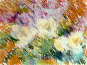
Tulips and Lilacs, soft pastel - Sometimes I am so inspired by the subject, the drawing comes in a clear, fast way. This one could be described as impressionistic. Not blending the strokes gives vitality to a drawing.
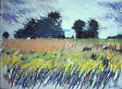
Route 52, soft pastel - This landscape was also done in a loose, sure manner, with soft pastel sticks, sort-of impressionistic, with a little expressionistic touch.
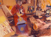
Self-portrait, soft pastel - This was a quick study of myself in the mirror, and my dresser with various objects. The object on the left is actually my pastel box, which I left in a less finished state. Pastel can have a casual, spontaneous feel, yet it can also be a very direct expression of emotion.
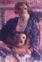
Woman with Dog, soft pastel - I saw this picture in the newspaper, and simply had to turn it into a drawing. For me, it was a readymade expression of so many things, about people and animals. I left the bottom part unfinished; I feel it keeps the pastel from being solidly in only one plane, and continuously dark.
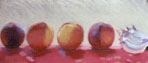
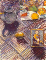
Still Life, soft pastel - I set these objects on the floor, and drew standing at my easel, looking down. This one has a more contemporary feel, yet has a classical quality to it, of the order of geometry. The upper right is part of a reproduction of a Cezanne still life; in the lower right is a photo of my nephew; in the center is a lemon. In pastel, the layers of colored strokes, and their direction, become part of the compositional structure. Here, I was interested in the geometry of the floor tiles, as well as the shadow shapes formed by the objects.
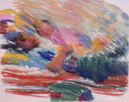
Cindi and Joe, soft pastel - Sometimes, you can just do a free gesture drawing of colors and shapes. It is great fun, especially with such bright colors.
Pastel Lesson
Using pastel to make strokes on the paper is part of pastel's true nature. These strokes, particularly hatching and cross-hatching, become part of the compositional structure, like in drawing; and the direction the lines go in gives directional movement in the composition. (See the still life example on the left.) Learning to orchestrate the strokes, to benefit from their part in the composition and their directional movements, is a big part of learning to draw and paint, and is a never-ending process and infinitely complex, encompassing all of the design elements, formal elements, and design principles. (See Design I: Meaning, Design II: History, Design III: Guidelines, and Design IV: Elements for more information on design.)