Nancy Doyle: An Artist Critiques Her Own Work
I've been an artist for over 50 years, but there have been times when I was unable to paint. Whether I was busy doing other things, or ill, or had family obligations, there were periods of time when I couldn't paint or draw. These times were difficult for me - I felt a constant need to work - but unfortunately sometimes we don't have a choice.
Art-making isn't like riding a bicycle. If we stop for more than a brief time, we don't stay in the same place - we go backward. When we try to pick it up again it can be difficult, and it can take a long time to regain this ground. We don't forget the technique of painting, but the connection between our minds, eyes and hands can be lost. In my experience, this means that if the absence has been longer than a year, we basically have to start over.
Nancy Doyle
Fine Art
1
2
3
4
5
In my case, after a 9-year period of working sporadically, I had to start at the beginning (back to the drawing board) with drawing. I began with pastels, which are kind-of a combination of painting and drawing, with simple classical still lifes (which I had never done before - I had done more contemporary versions as a young artist). I gathered still life materials - simple, classical forms such as teapots, pitchers, apples and pears, that had the curving shapes that I wanted. I wanted to just draw without preconceptions or expectations - just try to represent these forms honestly. I knew there would be disappointments, but wanted to keep at it no matter what.
After I completed one or two drawings, I thought it would be interesting and perhaps beneficial to beginning artists if I photographed the results of my efforts, to see my progress and to then critique my own work. After an absence, I knew that it would take a long time to come back (probably at least a year). I thought it would be good for beginning students to see that even mature artists can struggle, and that critiques that described specific issues of composition, color, space and of the materials used would be most helpful in the learning process, especially when the work being critiqued was not their own. I'm going to be brutally honest about my progress, my frustration, and the issues I see in my work.
I've done five pastels so far, which are shown above and below in the order in which they were done. As you can see, progress isn't a straight line; after a promising first try, I faltered more than once, and some were very hard for me to accept - downright embarrassing. But I've always seen this artistic strength training as an airplane on the runway: The plane starts slowly and gradually picks up speed on the ground. It seems like it will never take off, but after about a year of constant work (for a mature artist), it leaves the ground. It takes more time to reach a good altitude, but once it is really airborne it stays there until something stops its flight. The time it takes to get airborne again can seem slow and painful, and often there doesn't seem to be much difference in the images, but if we look at our first image and our most recent, we can usually see some improvement. Below are the five pastels I've done so far, with their critiques. Please see Glossary of Art Terms for definitions.
1
2
3
4
5
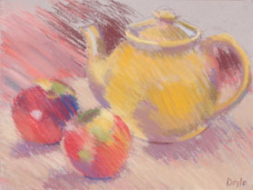
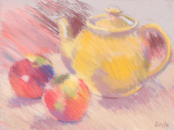
For these pastels I used Mi-Teintes pastel paper made by Canson, their 9" x 12" and 12" x 16" sizes. This drawing is on 9" x 12" paper. This brand of pastel paper has many beautiful and subtle shades - colors that are not quite neutral, and that react a lot with the colors added in the pastel. The color of the paper in this drawing is a beautiful warm pinkish gray with a middle tone, and I was excited to use the harmony of the reds and pinks, as well as the more contrasting yellow, which makes the background color appear more violet, as they are complementary colors in the color wheel. I also used an Indian red (a cool red) in parts of the background, and some small peach areas, as well as some lighter violet for the shadows. There is some ultramarine blue in the furthest apple, for some strong contrast of color and intensity. When you use colored paper, especially with a middle value, you can use lighter and darker values against it, and you can leave large areas of the background show through. I have always loved the shape of the classic teapot, the circular form with its curved handle and extended spout. I added two apples that had both green, red and yellow in them, to repeat the shape and yellow color of the teapot, and to add color interest, rather than totally red apples, which might tend to look more flat.
I am really happy with the color in this pastel, as well as the composition. I like the repetition of the circular shape, and the harmony and movement of the curves. I also like the way the forms are modeled to show their three dimensions, in a way similar to Cezanne - rather than smoothing over the gradations, they are left in discrete patches that are more modern in appearance. I love the colors of these patches, and they add color and depth to the forms, rather than areas of solid color that would look more flat. A lot of the colors are harmonious - pinks, reds, violets - with one small area of intense blue, as well as the use of yellow and violet for contrast. I also like the way the diagonal strokes from left to right are consistent throughout, which gives unity, and combined with the harmonious color it gives a peaceful feeling. The vertical positions of the forms vary (not in a straight line across), which is more interesting, as well as delineating their positions in space, which adds depth to the image (perspective). The only area that bothers me is the upper left background - where there are pink, peach and violet strokes. This area stands out because the strokes are not distinct like they are elsewhere - they are overworked, and blended too smoothly. It is overworked there because I couldn't get the combination of colors to work with the rest of the image, and just kept trying different things, but I was never satisfied. One of the hallmarks of beginning art-making is the inability to have the images work as a whole - often there is one area that never gets resolved. With experience, this happens less - but here, since I am rusty, I'm dealing with this. I'm happier with this image than with the others here, though, especially since it's the first one I did. The strokes are cautious, but not too abrupt, so the edges of the objects and background have a more relaxed feel than some of the other drawings here.
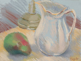
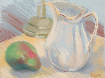
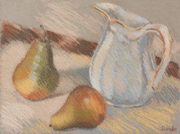
For this pastel I used a warm blue-gray paper, 9" x 12" again. I love the shape of the classic pitcher - the curves are so expressive and suggestive of the human form, and they flow throughout the composition. The pear has a very similar shape, so it echoes the pitcher in that way. Here, the color is mostly harmonious - grays, blues and greens with middle tones, with yellow and bronze accent areas, and an area of bright green on the pear, with a small area of red. A big, obvious mistake I made is that the bottoms of the pear and pitcher both sit in the same vertical position - another mistake common to beginners. Even when we try to avoid this, often in the throes of working we don't notice it until the image is established. Pastel is less forgiving a medium than oil, and early mistakes are hard to change. The pear should have been placed closer to the bottom edge, and turned so that the thinner top part was not on the same level as the large rounded bottom end - this accentuates the straight line the forms create across the bottom of the image.
While there is good harmony of color here, the weak composition ruins that, by having the three forms (that together form a triangle in the center of the paper) equidistant from the edges except for the top of the pitcher. Moving and turning the pear might help that situation, but it might not be enough - the areas between the pear and pitcher and the side and bottom edges of the paper shouldn't all be the same width. This creates a pathway from the pitcher handle around the pitcher bottom and across the image to the bottom left corner, curving up the left side. The forms should always relate to the edges in a more varied way, rather than forming an even, equal area that contains the forms within it. The forms should break through closer to the edges in at least one area. Another example of poor planning is the top of the pitcher touching the top of the paper, with a lot more space between the bottom of the pitcher and the bottom edge of the paper - it is an awkward placement. Though I like the way the pitcher touches the (top) edge of the paper, if the image is framed with a mat, one-quarter-inch of the mat would overlap the edge, so the pitcher would be cut off at an awkward place. The diagonal strokes are consistent throughout, but they are a little too consistently and quietly made - along with the overall middle tonality this makes for an image without much contrast or interest. There are not enough dark areas, that would increase the contrast and spatial depth, especially in the foreground.
I do like the overall color harmony, especially in the pitcher itself, with various shades of cream combined with gray, and the blue paper left as is in the inner parts of the pitcher, which connect visually with the background left showing in the top parts of the images. Often the objects we have an affinity for end up being handled better than ones we don't relate to. I had trouble getting the pear to "work," and am still not happy with it at all. Maybe I should have added more warm areas of green or yellow to it, which would make it more three-dimensional. Overall, this is a safe image, but not too exceptional. When we're working our way back, we aren't as adventurous as we should be.
Oh boy - where do I start? A big relapse... sometimes we just can't adopt the right attitude, like pro athletes in a slump. So much of it is in our minds, our hearts and our nervous systems - sometimes you have it, and sometimes you don't.
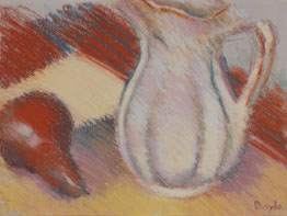
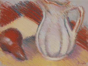
This image was also done on 9" x 12" paper. The placement of the pitcher and pear in relation to the edges of the paper is very bad. Once again I put the bottoms of both forms on the same vertical level - creating that straight line across, which flattens the image. And I put the top of the pitcher too close to the top again, which is awkward. The pitcher itself is drawn so that it appears three-dimensional, but the shading is way too even and similar, with the abrupt bluish curves too consistently of the same value. Where are the pitcher highlights? The pear is the same way - done in the same red earth color with hardly any modeling of the form (flat). Even worse, it is the same red earth that Is used in the background, which also flattens the image. I like the harmony of the three colors (red earth, yellow and blue) with the background gray color, but the other faults are so glaring that it is of little use.
The diagonal strokes are relentlessly similar and militaristic. The whole image is frontal, without any subtlety or shades of gray - only black and white emotionally - although ironically there are few areas of light and dark actually in the image. Both pear and pitcher are self-contained - that is, their edges are solid, without any areas that connect with the tabletop. (There could be places where the strong contour could be weakened, or colors could merge with the background in some places, etc., so objects and negative space could flow together more.) Overall, a setback, hard to accept.
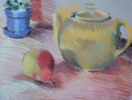
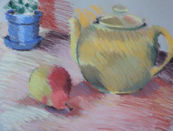
This time I went to 12" x 16" paper, another gray background. I also added a small plant to the mix.
This one was really hard to accept - notice that I didn't even sign it, and after I photographed it I couldn't wait to throw it away (get rid of the evidence). It looks very labored - the strokes are at once too controlled and not very controlled - on the table they go up and down like the surface of water. Also on the teapot, the modeled patches don't seem coordinated, like on the teapot in number one above, and the teapot doesn't look three-dimensional as a result. The blue planter is modeled very uniformly, which takes away from a natural realism. The modeling on the pear is a little better - it seems to sit on the table - but is not remarkably done.
The colors don't seem to be blended well - there are separate areas of blue, yellow and red, and there are no "connecting" colors on the objects that would unite them visually, other than the yellow on the pear that connects with the yellow teapot. I tried to connect the forms by varying the color and tone on the table, but it didn't work, and the tonal range of the table is not great enough to add spatial depth to the image.
At least here the pear and teapot are not in a straight line across the page - the pear clearly is in front of the teapot as a result. I tried to create depth by putting the planter very near the top of the image. But the teapot is the main culprit here I think. It is too close to the top of the paper, and too large (out of proportion to the other objects). I usually lightly sketch in the forms, but it didn't seem to help here. If I had left the background gray show in the bottom left, that might have helped to visually connect the background and foreground, and unify the image. It usually helps to scatter the colors around the image, for example to add a red or yellow color to the blue planter (like violet in the shadow) - but I didn't do that, creating a flat monochrome that is isolated in the image. There is no flow between the objects and the table - the objects are too self-contained. Overall, this image is poorly conceived and poorly executed - a real disaster!
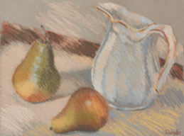
Well - back to acceptability... After the last two failures, I was almost afraid to step too close to the easel. Morale-wise, I needed a victory, just to keep going, so I played it safe here. I used another middle-tone 12" x 16" paper, this time of a warm brown-gray. I used mostly earth colors - olive green, bronze, warm red, soft yellow, light cream and dark Indian red - along with light and middle gray and light blue, with a flesh color for the table and added to the background to keep the dark diagonal from separating the background from the middle ground, and to unite these two areas visually.
I finally got the pitcher in a pleasing proximity to the top of the paper, and the three forms are not in the same vertical position, but the pear in front is not placed well in regard to the bottom of the image. It is too horizontal, it should have been turned so that the smaller top area was closer than the larger back part, and to keep it from being parallel to the bottom edge of the paper. But the worst part is that the front pear is in an awkward position in relation to the bottom edge - it should have been a little further away. As it is now, it doesn't look that bad - but if this image were framed with a mat, the mat would cover the outside 1/4", meaning that the edge of the mat would exactly touch the bottom edge of the pear - very awkward visually. But the pitcher and the pear on the left are almost in the same vertical position - I should have moved the pear down closer to the front so that they wouldn't be. I think I could lessen this effect by going over the shadow on the very bottom of this pear - by going over it with the flesh color. As small a change as this would be, I think it would make the similar vertical placement less obvious, by eliminating the value contrast right at the bottom center point of the pear.
I think that the color is harmonious in this image, and I like the warm tonality of it. The light blues and grays in the pitcher and the table are a subtle contrast to this warmth. Overall the curves in the forms, as well as the harmonious color, carry the eye throughout the image in a fluid way. The diagonal strokes are consistent, but not forced or monotonous. There is a harmony and good range of tone, with some more value contrast than in some of the earlier drawings, with the cream highlights on the pitcher against the dark Indian red of the table. I like the soft touch throughout, a result of a mellow mood, where I could work more patiently until the image was finished. This was another "safe" image, but I needed a success so I could keep going!

Well, so far I've made a little progress - in my drawing, my compositional skills, my use of color, and my comfort level. I think the #5 image is the most formally successful, avoiding the most egregious errors of the third and fourth drawings, with a more natural-looking and contrasted image, that holds together pretty well. My beginning efforts are timid and careful, but once I reach the level where that comes more often, I can then start to shake things up by being more adventurous. My mature work is characterized by an Impressionist looseness, so I regard these studies as preparation, an academic means to an end. But the longer the absence from art-making, the further back I need to go to recover my mojo.
I am inspired by the last paintings by Edouard Manet, the 19th century French painter. His career began with ambitious history and art- historically-derived paintings, but for health reasons his last images were smaller and more humble. He painted a series of small oils of flowers in clear glass vases - just a few flowers mostly, against simple dark backgrounds, loosely painted. These simple images somehow express more about mortality, more about life, than any of his more "important" works. If you want to be inspired to express the monumental in the small things around us, check out these images.
6
For the next image, I worked in oil paint on canvas, about 11" x 14". I was doing a painting for an art show that requested we submit work that honors great artists of the past. I chose Cezanne's early period for my painting, as that seemed to fit what I had in mind to do. (When young, Cezanne painted in a very bold style with a lot of value contrast from white to black. He also used a color palette of white, black, and grayed-out versions of blue and red. He hadn't yet met the older painter Pissarro, who would encourage him to paint from life in a more impressionistic manner.)
Compare this to my usual way of working here.
It was nice to take a break from pastel to work in the much more forgiving medium of oils. I've been painting for almost 60 years, and began with oils, so it seemed less frustrating for me than with pastels. I have created a webpage showing the evolution of this image, in five stages. I began blocking in the forms with a semi-transparent layer of sepia, which I had thought would be a warm purplish-brown, but it turned out to be a more neutral gray-black. I allowed this to dry for a few days, then added a nice blue over the wall area, the area across the bottom, and in the pitcher and birds. Then I added alizarin crimson, a color that I hadn't used for many years because it can be a hard color to harmonize with other colors, because that seemed like an early Cezanne color. I went over the wall with alizarin crimson, parts of the pitcher and pears, and in the table cloth. As I feared, this color overwhelmed the painting, especially on the wall, so I then rubbed off some of the red in the center blue area of the wall. This left the dark area in the upper right corner of the canvas very dark, which is what I wanted. I then re-added blue in the wall to lighten it, as I realized that I liked leaving the area of the left wall light, as though it was a reflection from a window, and added highlights to the forms on the left side. I then added yellow ochre pale to the pears and pitcher, and mixed it with alizarin crimson for parts of the cloth, so there would be a connection visually. And I mixed a color to add to the right side of the pear in front, to indicate shadow, and added a mixture of alizarin crimson and white to the lighter parts of the cloth. Finally, I added the lighter white color to the pitcher and some warm gray-blue shadows on it and the birds. Finally, I added a red-brown color in the pitcher and pears, as well as the cloth, and a deep yellow to parts of the pears, and a brighter yellow to the pear in front.
I feel that this painting is somewhat successful, as the sixth in my series of conventional still lifes. It is somewhat stiff, with the forms having strong separation from the areas around them, but since I was making a tribute to early Cezanne, this seemed appropriate. The colors here I haven't used since my years in art school, before I, like Cezanne, changed to using Impressionist color - rarely using dark colors like black, but preferring the primary colors of red, blue and yellow, with green and violet. The Impressionists used a different kind of space too - more flat, less volumetric like the painting above, where the forms are modeled in light and dark, rather than color. Impressionists used a more flat space, where all parts of the canvas are on the same plane visually, because a dark area like black would put a visual "hole" in the painting. But since I'm re-entering the painting process, it seems appropriate that I would start with a more traditional and volumetric approach, using value rather than color to depict form. Cezanne is actually considered a Post-Impressionist, because he carried Impressionism further by marrying it with a classical sense of three-dimensional form. But when he met Pissarro, Pissarro taught him to work in a more Impressionist fashion - with less solid forms, to try to depict nature with light and color, rather than tone and volume. Cezanne worked in this fashion, from life, but gradually went beyond this in creating his own hybrid space - a marriage between traditional Renaiisance space and the more contemporary flat space, which was a result of the influence of Japanese art prints on Europe at that time.
I'm uncomfortable with the strong contours in this painting - particularly in the pitcher - and the strong contrast of dark against light also feels harsh. The contour is strong all over, rather than blending with the background in some areas. I was painting in the old-fashioned way, blending the colors, not like the broken color application that I've used since art school. I had to summon all my patience to do this blending, and it wasn't easy to keep at it. But I'm trying to be disciplined and go through this awkward phase in my re-development, even though my instincts tell me to jump ahead - I need to walk before I can run! I've learned over the years that the way to freedom in painting is to gain control of your drawing skills - a seeming contrast. I felt like I gained a little more control in doing this painting, and I look forward to painting more freely again someday.
The composition is more successful than above, because with oil I can change things endlessly, and correct them. The pitcher is well placed, and the pears repeat this same shape. The image seems "solid" to me, or stolid, so I think the two birds add a note of lightness or whimsy to this heaviness. The pattern on the cloth is handled without much perspective; Cezanne's early work often has the same frontal flatness, a denial of perspective; and his later work continues this practice. I feel that this painting is somewhat successful, but personally I don't like it much. It is a means to an end for me.
6
UPDATE: After I completed the above images, I went through another period of great change. I moved twice, my father passed away, and so forth... It was another year before I could get back to my work, only this time I was motivated in a different way. I am now living in a wonderful place where I feel very much at home, in the country. It is peaceful and safe, and frankly it is my chief happy place. I had forgotten how important this is to my work. Instead of doing still life studies, I dove right into some images that mean a lot to me, just out of sheer need to express them.
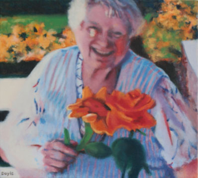
The first one I did was of a woman named Bertie, whom I worked with in my part-time job as a caregiver to senior citizens. I felt that the image was very expressive not only of Bertie's emotion, but also expressed something I see in many older people - just her humanity. Rather than working stiffly and tensely, as in the above still lifes, I painted quickly and with joy, and as with all paintings that I feel deeply, basically painted itself. I feel pretty happy with this image, although I can see some flaws. First, when I stretched the canvas in preparation to paint, I didn't have the size stretchers I wanted for the width, only the same size, which meant it would be a square image instead of the wider width I had originally planned on. I think the composition suffers from this; maybe I will do another version of it in pastel at some point and correct this. (I had waited so long to paint this image, so I just didn't have anymore patience to wait to get the larger stretchers.) I feel that the color is pretty good; I like the fact that I used more jewel tones, as Bonnard used, which is a more advanced use of color than I had before. I am very happy with the expression - the image says what I wanted it to say, and I was amazed and grateful that I was able to paint on this level, and didn't have to wait to reach a higher level of painting. It was just a quantum leap, which I am grateful for - I don't have the time to grow slowly!
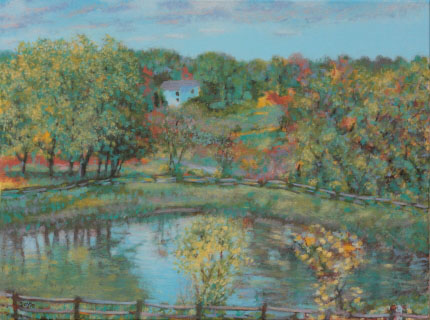
The next painting I did was a larger landscape, the view that I see out my window. It is a small pond surrounded by trees and a wooden fence. When I moved in, I was so happy to see that view every day, especially after living for 11 years in an urban setting. Just like the above image, I dove right in and again, the painting seemed to paint itself. I usually work slowly, with layers of color, first painting general large shapes and gradually becoming more specific. I started with yellow underpainting, let that dry, and then used copper over it, allowing the yellow to show through in areas. I have found the copper color to be very useful in my work, as it is a "red" without really being a red, and is an earth color. Then I began adding variations of green and blue throughout, as well as sepia for the dark areas. Sepia is another useful color, as it looks 'black,' but is actually a warm, dark reddish purple/brown, so it activates the other colors, just like the copper does. I added white for the sky, some medium dark violet, and some peach areas. The water reflections were a challenge, as I haven't done much of that, but I enjoyed doing the water a lot, so much so that I plan to do more water images in the future. This painting took awhile, adding layers of color and letting them dry before continuing. I feel that this painting is pretty successful. Again, it has flaws, but I think it also expresses something, and for me that makes up for the flaws. It expresses my joy in living here, and my love of this rural landscape and environment. I feel that the water could have been painted better; it was complex doing the tree reflections and the leaves and trunks/branches. I especially like the area of the yellow bush against the white and blue of the water. And I like the way the fence forms a circle in the painting (echoing the round pond), and how the fence disappears on the left and right edges, only to reappear below. I always wanted to paint more water landscapes, but never lived near a body of water before. But now I know how Monet felt when he moved to Giverny; he started painting the lily pond there, and never looked back. I can see exactly how that happened now, and I see myself moving in the same direction. I'm already planning another pond painting, and a tree-lined creek. At this point, I was still amazed and grateful that I was able to paint on this level, without having to struggle for years to get there, with two successes in a row. I am always trying to get better, and really there is no limit to how much better we can get, but I'm still happy that I don't have to start at the very bottom!
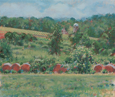
The third painting I started was another landscape, again a local landscape of bushes, weeds and a field in front of a house and silo. Round hay bales are in the middle ground. Again, I started with an underlayer of copper on this small canvas, and I also worked slowly on this image. I let the copper show through in certain areas, and it interacts with the greens, yellows and blues I added later. I used very small brushes - which I have seldom done - working patiently with many layers of color applied in a somewhat impressionistic way with small patches. I used Naples yellow and a little Indian yellow, as well as many greens, some from the tube and some mixed. I used Prussian blue for the sky and the darks in the vegetation, which I expected to be more of a warm turquoise, but it was a different brand of paint, and it turned out to be more grayed-out. I decided to keep it like that, and used it to mix some of the blues and greens. It is mainly earth colors in this image, also unusual for me. This painting, though about 11-12 inches each side, took over 2 months of working slowly, with many colors and layers, and small patches of color. I just wanted to work this way here; I think it was part of the loving way I felt and painted the scene, as its expression. Again, I love this area so much, and I wanted to express its unique beauty and peace. I feel like this image is the most successful landscape I've done in this naturalistic/impressionistic way - it took many years to be able to do it. I love the tiny "white" highlights in the bushes in the front. Now, I have done 3 successful paintings in a row, and am astounded! I've already started on a small still life, 8" x 10", of a beautiful teapot and two small seashells. I want to paint it in a similar manner as the landscape below - slowly, with small touches of colors that interact in a strong way, and layers of color. Using small brushes is not typical for me, and I don't think I have the patience to keep on doing that - but it is very nice to do it on these two images, and I felt that the expression of them both required that I work this way. Stay tuned!