There are general "rules" used for good design/composition. However, for every rule I've ever heard, I have seen a great work of art which breaks it. Therefore, I will write about general guidelines, which are far from written in stone; and have evolved and changed for the last 2000 years, and are changing still. Sometimes what has happened in the past is that there is a major artist who has a profound influence on his contemporaries, or those that come after, and his/her methods have been studied and followed, in the hope of capturing the formula for good design, or good painting. His/her theories are followed religiously, until eventually another great artist comes along with new theories, and the process is repeated. Cezanne is an example, and Poussin before him (actually Cezanne was influenced by Poussin); which is ironic, because Cezanne believed in theory coming from the work itself, rather than preceding it, and also in the responsibility of each artist to find his own path. But perhaps because art is an "inexact science," human nature seeks some reassurance, some certainty, some objectivity, some quantitative measurement and judgment. In "academic" art, meaning that art which is devoted to more traditional compositional tendencies, this seeking can solidify into rigid "rules" of design/composition, which can lead to a sterile formula-ridden art, a la "step one, step two..." This is the method often followed by popular publications, which list these tricks and techniques to a successful painting. This doesn't teach principles of design as much as show anyone how "it should be done," or "how to succeed every time." I heard once that an amateur artist is one who always succeeds; a professional artist is one who never succeeds; this means that learning techniques and step-by-step instructions can make a "successful" picture - but these efforts are seldom art which has been created from the "inner necessity" of the artist, a true record of the artist's searching and discovery to bring a meaningful expression into the world. They are often a pre-packaged formula which is geared toward perfection of one's technique, or manual dexterity, often resulting in a purely visual and shallow artwork. Also, the implied meaning is that the amateur artist succeeds because he/she is aiming for a less lofty goal than the serious artist, who is seldom content, but always growing and searching, not settling for mere technical perfection, but rather a lifetime of exploration and never-ending quest for as high a quality of expression as possible.
For, though every artist seeks to make his or her work as good as possible in composition and other 'formal' elements, the main quality of a work of art is in its expression, not its technique. Students should do much studying of composition; and mature artists should continue to learn their craft and their visual skills; but a work of art of high skill which has no meaning other than its outer appearance is a hollow expression. In fact, many serious, mature artists create work which is only marginally connected to any sense of "design," for instance the Abstract Expressionist painter, Mark Rothko, who painted ethereal abstract works of soft-edged, light-illuminated rectangles of color. His primary intention was a spiritual one, one not burdened with such manmade, "premeditated", temporal stuff such as design, but rather, the 'pure' spirit coming through. I would say that the primary consideration for serious artists in composition is what they are trying to express - the meaning determines the structure, the composition, and the meaning is conveyed by the composition. Similarly, though the same visual principles and elements are used by both the fine artist and the graphic artist, the different intentions of the two will create a world of difference between them: one to sell a product, and one to create a meaningful expression.
This series of design pages is a result of all the art courses I've ever taken, all the art I've looked at (including my own), and my painting experience of over 50 years. I have an intuitive approach, which is how I was taught, and where I feel most comfortable; many universities have intensive, systematic design courses with a multitude of visual problems to solve, etc. I would recommend many of these courses, and basic design textbooks from such courses, however I don't have much of that here. I would advise you to try to avoid the magazines and books that tell you how to make a painting, step by step; I have avoided them 99% of my life, in the fear that if I knew the 'correct' or 'easy' or 'fast' way, I wouldn't be able to forget this solution when I was in front of the canvas - I wouldn't be able to discover the 'right' answer myself, the right answer being the one for this time, for myself, for this painting I have in front of me. So, though many artists plan their compositions ahead of time, do preliminary studies, etc., much valuable experience can also come from finding the right composition while working on the painting. There are two books on design that I would recommend: Vision in Motion, by Moholy-Nagy, a 20th century modernist; and Cezanne's Compositions, by Erle Loran, a study of Cezanne's compositions, including directional movement and division of space. I also recommend that you read my first two design pages, Design I and Design II, before reading this page, because there are several basic concepts described there which may help you to understand the general design guidelines better.
First of all: art is not a verbal activity. This means that to try to put visual concepts into words is like reading a novel by looking at the illustrations. Words are inadequate; but we must use language to communicate. Also, there are many variables in composition - an infinite number - among the elements of line, shape, color, space, etc. When all the possible combinations of these elements are considered, you have an enormously high number; and they are all interdependent - you cannot talk about one without the others and their possible combinations, for instance, color and space. And, changing any one of these elements can affect all the others in the painting. Each line, mark, shape, or color has its roles to play in the entire composition - each must serve its function in a finely tuned balance. Also, there are many aesthetic viewpoints - minimalist, representational, abstract, expressionistic, etc., as possibilities in painting. Mature artists will make their choices both from their environment and their "inner necessity," as Kandinsky called it - their inner artistic voice. For beginning students, actual painting experience and experimentation will set the process in motion of discovering their personal vision.
There are two basic modern visual concepts in two-dimensional art:
figure/ground: The ground is the actual flat surface area of the painting or drawing, also known as the pictorial surface, or picture plane. The word figure means the object depicted on the ground. Simply put, if you are looking at a portrait, the person is the 'figure', and the background is the 'ground.' Paintings often are more complex than this simple delineation, for instance a landscape consisting of 'deep' space, of cornfields in the distance, with no distinct object in the foreground, rather more of a continuous area than an object on a ground. However, the main thing is to be aware of this basic concept. In much contemporary painting, this concept has been replaced by a sense of there being no figure/ground relationship or division, but rather one continuous 2-D and/or 3-D space.
positive/negative space: A related idea to figure/ground is positive and negative space. Positive space is the areas of a painting or drawing which are occupied by a form or forms (again, the person in the portrait). Negative space is the areas of the painting or drawing which are not occupied by forms, i.e., "empty" or negative space. My basic design instructor said it simply, "There is no such thing as background." In other words, all areas of the work are equally important - there is not a background area which can be left unconsidered. It is OK to have a "plain" background - but this must be a deliberate decision, and not because it was simply disregarded. This is a modern notion, which gradually came into being starting in the mid-19th century, with Manet and the Impressionists, and continued to evolve into even greater 'flatness' throughout the 20th century. Flatness is implied because both positive and negative shapes are equally important, and considered on the same plane in space (background not being in the "background") - the "plane" being the painting or drawing surface. Because positive and negative shapes are equally important, they must both be given the same compositional consideration in a work of art, without negative shapes (or "background") being neglected. Therefore, in a painting of a chair, for instance, the spaces between the seat and arms of the chair, as well as the space around the chair, would be given equal consideration in the design of the painting.
There are also different approaches to design, the most basic being the division between traditional and representational art, and contemporary art. These are described in more detail below. There are also ways to further categorize types of compositions: primitive (generally untrained or pre-Renaissance type of flatness and pattern, e.g., Grandma Moses; also, since the mid-19th century, many artists have used this flat composition); gestural (a 20th century approach, seen in the Abstract Expressionists' works, e.g., Franz Kline); structured (a modern and contemporary approach, such as Jasper Johns' grids); organic or biomorphic (such as Miro or Gorky); geometric (e.g., Mondrian); curvilinear (such as Matisse). There are also different concepts to prioritize: form versus light and color; drawing (line) versus painting (mass); classical order versus emotional (expressionism); traditional (representational) versus contemporary (transforming/abstract); premeditated versus spontaneous; value (light/dark) versus color; conscious versus unconscious process (Action Painting and Surrealism); deliberate versus chance/accidental/dreams (Surrealism). Individual artists move between these poles, as does art in general, between the structured/ordered and the free/spontaneous; between cerebral and emotional. Beginning students need to explore these areas to find what suits their temperament, their sensibility.
Within this flat surface called the picture plane, the artist places forms (objects, figures, lines or shapes) in arrangements, similar to the way a composer will arrange the notes, melody and instrumentation in music. These forms will have an underlying linear structure individually, and as a unit. For example, a bowl will be half-sphere, with an ellipse at its top (or a full circle if looking straight down at it); a tree would be a vertical line or cylinder, with the leaves in a spherical or conical shape; a wooden chair would have a linear structure of geometrical forms such as squares or rectangles (or cubes), with vertical and horizontal lines (and diagonal if not looking straight at it). This linear structure can also be called the scaffolding or architecture - of each form, and of the painting as a whole. A painter can plan this structure ahead of time, or find the structure through working and studying the relationships between the forms, in terms of drawing, color, space, value (light and dark), etc. But the artist must learn to see the relationships as a "whole" - a unified picture, in each painting, and also in general; this can take many years of painting to learn. This whole arrangement is an expression of the artist's vision and statement.
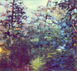
Another consideration is the concept of space in painting, which I cover in more detail in Design IV. Basically, there are different types of space in painting, practiced throughout history. The earliest can be called 'primitive' space, which is that of the earliest artists, and some trained and untrained contemporary artists. It consists of a flat surface, often without perspective, modeling of lights and darks or shading; instead emphasizing flat patterns or decoration, for instance Grandma Moses. Oriental art also has a tradition of a flat surface in painting. The word 'decorative' can have a negative connotation in art, suggesting that the work is 'too flat,' more like the physical and emotional shallowness of wallpaper, rather than a work which has some suggested physical and emotional depth. In the 19th century, painters in France were influenced by Japanese prints, and started an evolution toward flat space in western painting, which continues today. Another type of space is illusional space, which was developed during the Renaissance, and consists of a system of perspective to depict forms receding into space (parallel lines depicting forms such as roads which appear to converge in the distance). This type of space predominated from the Renaissance until the mid-19th century (although some traditional artists still use this representational approach). Cezanne evolved a new type of space which combined the attributes of both of these two types of space - flat and illusional - to create paintings that contained a powerful tension between these two spatial concepts, which influenced 20th century art in a major way. There is also a modern type of space, developed initially by Jackson Pollock, which is a flat, all-over type of space that perhaps resembles infinite space - like that in outer space.
Traditional painting (realism or representational art) uses the system of perspective to depict space, either linear perspective based on a semi-mathematical system, or atmospheric perspective, which is a non-mathematical, artistic method of suggesting distance. It consists of lessening the intensity and contrast of tones and colors as the forms recede in space in a painting, for instance in a landscape. As we often see in nature, the distant hills and trees will appear more pale, with less contrast, less detail, etc. Artists have been using these two techniques since the Renaissance; the Impressionists particularly used atmospheric perspective to indicate spatial distance. This is one of a number of 'spatial cues' used by representational artists to suggest deep space. Others are: decreasing the size of objects as they are further away; overlapping of forms to suggest depth; putting more contrast in the forms closest to the picture plane (light and dark); moving the further forms higher up in the painting; using modeling to depict 3-dimensional form. (See Design IV for more information about spatial cues.) So, representational paintings have a tradition of foreground, middle ground, and background, whereas modern painting often places little or no emphasis on the illusion of distance. There are spatial dynamics in modern painting also; certain forms may be composed to suggest difference in spatial position, by some of the same methods: overlapping, size, contrast of value or color, lessening intensity of color, etc., within what is referred to as the 'integrity' of the picture plane - which means that there is the tension between 2-D and 3-D, but that the essential flatness of the picture plane has not been challenged.
Other traditional methods include: blending and modeling of forms to achieve three dimensions (as opposed to the more modern way of using separate strokes, marks, dabs, etc. to create a more flat, two-dimensional work); using a 'focal point,' which means a center of interest, a main subject or form (as opposed to the modern concept of the entire (all-over) picture plane being equally important); relying on value and tone (lights and darks) to achieve form and compositional unity (as opposed to the modern dependence on color); linear perspective (as opposed to atmospheric perspective, or no perspective or illusional space at all in modern works). Representational, or traditional, art, tries to create the illusion of "real" space in a painting; modern and contemporary art (except for contemporary realist painters, of course) wish to create a non-illusionistic art - the reality for them is the flat space of the canvas. In art since the Manet and the Impressionists, the "dab" becomes an actual structural unit in the composition, similar to the idea of a mosaic.
Another important basic concept in composition is the relationship of the form(s) in a painting to the four edges of the picture plane, or canvas. In other words, the relationship of the object(s) in a painting to the outside edges of the work. This relationship must be considered - even if the decision is to place the object(s) in the center of the painting, without touching the edges. This refers to the tendency, common in beginning students, to place the flower pot in the center of the painting, and leave the rest as background, without consideration of the relationship of the form of the flower pot to the edges. There are several ways to introduce students to this concept: 1) when drawing or painting an object, have the object(s) touch the outside edges of the canvas/paper in at least three places; 2) cut a rectangular hole in a piece of paper, and use this 'viewer' to try to frame different views of your subject, to decide where to place your forms within that rectangle; 3) try to integrate the form/object and the space surrounding it, so that the two are not separate entities; this could include having a contour which is not solid or continuous, which opens into the negative space. I once saw a da Vinci drawing of a copse of trees, which was placed in the middle of a large white paper; but he made this centering work by the fine linear drawing of the trees, with lots of small open areas in his drawing, which connected to the white space surrounding the form; plus, he placed the copse just slightly off-center, to avoid a symmetrical look.
Some general guidelines and tips regarding composition:
- You can make sketches or studies for your composition ahead of time, in pencil or charcoal, for instance, trying different possible compositions until you find one you want to use.
- You can keep your composition sketchy or tentative, while working, until you are more sure of the visual relationships in your composition, and the placement of objects/forms.
- Start with the larger masses of your subject first; when the larger masses are established, then get the smaller masses and finally, the details.
- Work on the whole painting at once - don't start in one place and go from there. (I am reminded that Georgia O'Keeffe supposedly started her paintings in one corner, and proceeded to the opposite corner - but generally, especially for beginners, it is much better to work on the whole painting at once.)
- Work from the general to the particular.
- Try to frame the subject of the painting within your rectangular (or square) canvas; one way of doing this is to make a "viewer," by cutting a rectangular or square hole (the same proportions as your canvas) and look through it while moving it around your subject, to choose a composition which fits well in this viewer.
- Be aware of how your subject relates to the four outside edges of the canvas, and how your subject is placed within those edges. Looking through a window at nature (or a city street) is a similar experience to framing your subject.
- Try to consider as many possibilities for your composition as you can - and try to consider as many aspects of your painting as you can. The use of chance and accident can be very important in art - but as a beginner, try to make considered choices, rather than haphazard ones. And don't take anything for granted - leave your preconceptions outside.
Elements of Design/Composition:
- Formal Elements: Color, space, composition.
- Pictorial Elements: Line, shape, color, value, texture, space. (See Design IV to see pictorial elements in more detail.)
Line: Lines can be curved (curvilinear - curving around and through the picture space); or straight (geometric). They can be contour lines, or lines inside the forms. Lines can create directional movement in the picture plane - leading the viewer's eye around and through the composition, such as a road (diagonal line) leading the viewer's eye into the landscape. Directional lines can also keep the viewer's eye from leaving the picture. Lines can also direct movement and counter-movement; like in music, there is a movement and countermovement. For instance, a diagonal line going from top left to bottom right will create a movement downward to the right; if another diagonal is placed at the bottom right of the first, in the opposite direction, it will stop the movement of the first line, or neutralize it, stabilizing the composition. Or, if you have the same diagonal from top left to bottom right, and you place a series of short lines along it, going in a perpendicular direction, you will also neutralize the movement of the first diagonal line. If you get rid of the first line, but keep the series of short lines along it, you will have a series of short lines going from bottom left to top right, but as a group they will be going from top left to bottom right. This is movement and countermovement in one set of lines. Short lines can also be marks, which can create pattern or texture when placed together. (See Van Gogh's ink drawings.)
- In choosing a composition, start with your subject; for instance, is it a landscape, portrait or still life (or other)? If it is a still life that you are setting up, you can determine your composition by the way in which you place your objects on a table; you can try to distribute the sizes and weights, instead of placing the taller objects together on one side of the painting, for instance. Your objects will probably be variations of simple geometric forms, such as cylinders, spheres, cubes, etc. This may be conducive to a geometric-type composition. In a still life or portrait, the objects/forms may combine to form a geometric shape; for instance, a portrait of a person which is from the chest up often forms a triangular shape, for example the Mona Lisa. This device has been used at least since the Renaissance by many artists. A still life of bottles and fruit may also form a triangle or other geometric form. If your still life objects are more organic, such as plants and flowers, this may lend itself to a more curvilinear design (curved lines moving around the picture surface, such as Matisse). A landscape of trees may also be suggestive of an organic composition - or a combination of geometric and organic, straight lines and curves. With the invention of the camera in the mid- to late 19th century, artists saw compositional possibilities not seen before; with "snapshots" - objects were cut off at the edges, and placed haphazardly, giving a "modern," casual feel to them. For instance, in street scenes, there may be a pedestrian who is only half visible, moving out of the picture plane. Degas took advantage of this quality for many of his compositions. (This influence also was caused by the Impressionists and Post-Impressionists looking at Japanese prints, which were circulating in Europe at this time.) In general, try to "use what is there" in your subject as a starting point: what qualities do you see in terms of: horizontal or vertical direction of the subject (horizontal landscape or vertical portrait); in terms of overall geometric shape; in terms of visual patterns and surface ornament, such as striped or patterned material in a still life; in terms of texture (visual) in the subject - landscape or still life; in terms of diagonals (a book receding into space); in terms of what you may be trying to express - mood, color choice, etc.; in terms of a perceived underlying structure in the subject (landscape: vertical lines of trees) (still life: spheres of apples forming a pyramid in a half-sphere (bowl)); in terms of deep space (landscape) or shallow space (still life); in terms of viewpoint: looking down on a still life, looking up at a landscape of trees; in terms of an abstract design: anything that can be imagined, or based on natural forms seen - even through a microscope or telescope.
- Base your composition on that of another good artist - for instance, Matisse or Chardin for still life; or Cezanne or Rembrandt for landscape.
- Try using the Golden Section for dividing up the picture space. In a line, A to B, or AB, divide the line at C, so that the ratio of the two parts of line AB, smaller to larger, is the same as the ratio of the larger part (CB) to the whole (AB). Whew! This relationship is mathematically expressed as 0.618:1.
Shape: Shapes can be made from "uneven" lines, like the dab, or comma mark. Or they can be all kinds of masses - even, irregular, round, square, rectangular, elliptical, fat, thin, large, small, organic, geometric, solid, or "empty" shapes inside a continuous line, etc. Individual objects have shapes, and also combine with other shapes to create larger shapes in the composition. Shapes can also be used to create directional movement, by the direction their forms move in, or like line, by placement together to form a directional movement in the composition. For instance, pieces of fruit next to one another in a curved line from left to right, perhaps tilting downward toward the bottom edge of the painting. The same directional movement attributes as listed under Line, above, apply to shapes. Shapes can also be the main masses in the composition (e.g., a bouquet of flowers has an overall round or conical shape; or a street scene can be a series of geometric-shaped buildings, which also join to become a larger geometric shape). Shapes can distribute the weight in the composition, and determine the balance of left and right picture plane, and top and bottom.
Color is more than filling in the drawing. Color can have its own structural role to play in the composition. Generally, colors can be divided into warm, cool, and neutral. Warm colors are colors that have more yellow in them; cool colors have more blue. So, yellow and orange are warm, blue is cool. Green, purple and red can be warm or cool, depending how close each is to blue or yellow. For example, a warm red is one which leans toward yellow (vermilion); a cooler red would be one which has more blue or purple mixed in (alizarin crimson). Warm green has more yellow (cadmium green); cool green has more blue (viridian). A warm purple contains more red (cobalt violet); a cool purple contains more blue (mauve blue shade). It actually gets a little more complicated than it seems, because by mixing more colors together, you can get warm and cool browns, grays, and other hues. Cool colors are thought to seem to recede in space (as often the distant trees and hills seem more blue than closer ones), so using cooler colors in the distance in a landscape can suggest depth. Color relationships are actually a very complex and often unpredictable element, and benefit from long experience and study. Josef Albers was an artist who devoted his life to the study of color relationships; he wrote a well-known book called Interaction of Color. The original published book is very large, and very expensive - only a certain number of copies were made, mainly for academic institutions. A smaller version is available for the average person, and I highly recommend it for both approach and systematic study. He devised a series of lessons in color designed to illustrate how relative color is, and how the appearance of colors can be altered by placement next to another color or colors. Different colors can be made to appear the same, by separating them with certain third colors; and the same color can be made to appear different by placing certain third colors in between two pieces of that color. A neutral color is by definition a color which is neither warm nor cool, and theoretically this means that two complementary colors are mixed together to create a neutral, although there are other ways to create neutral colors. The three primary colors are red, blue, and yellow. Secondary colors are made from mixing two primary colors together (blue and yellow make green). The three secondary colors are orange, purple, and green. Colors opposite one another in the color wheel are considered complementary - e.g., red and green. This means that theoretically red and green mixed together create a neutral color. They also, if placed next to one another, can make each other seem brighter, as can yellow and purple, and orange and blue. Color can be used in many ways in composing paintings; it can connect areas of the painting through similarity of color; it can create contrast by difference of color; it can be used to create spatial depth; create harmony through color family harmonies; create pattern, structure, and mood. An artist can use local color (the actual color of an object, unaffected by light or reflected light); or independent color, as in Gauguin's work, where color is used more subjectively, independently of local color. Color can create a center of interest, by contrast or brightness.
Value: Value, or tone, simply means lightness or darkness, of area, line, shape, etc., from white to black. Value is used, as is color, to distribute areas in the composition; value (and color) can be used to create a composition, or unify a composition. In painting, value is generally used in conjunction with color; e.g., a warm red that is either light or dark. Value is used more in drawing and traditional painting; contemporary art tends to focus more on color than value. A rich range of values, however, can enhance a drawing or painting. Differences in tone can model form (three dimensions) - also a more traditional element. Similar values placed together will tend to recede into space, whereas a contrast in values will tend to come forward in space. Value can be created by a flat tonal area; or by lines or marks placed together - the closer the lines or marks, the darker the value. Value is also relative in the same way that color is; a dark tone set against a medium tone will make the medium tone appear lighter. Value, if used sensitively, can be made to be as "coloristic" as color - dramatic and vibrant.
Texture: Texture means a visual patterning formed from marks, lines or shapes. It can mean the texture on an individual form (an animal's fur), or it can mean an area of visual texture in a painting or drawing. For instance, cross-hatching is a texture formed by sets of parallel lines superimposed over one another. Van Gogh also used small marks in his ink drawings placed together in areas to form "pictorial" texture, as in his landscapes. Together, his marks form a textured pattern that perhaps suggests a field of earth or crops, etc. Visual texture can add a lot of interest in a drawing or painting.
Space: Space is also a complex pictorial element; See Design IV and Perspective for Artists for more information. There are different types of space, outlined in the above paragraphs: primitive, or flat, space; illusionistic, or Renaissance, space; modern space (based partly on Cezanne's union of flat and illusionistic space); and all-over space, first done by Jackson Pollock in his drip paintings, which resembles infinite space. Painters will use a certain type of space because of its affinities with what they are trying to express. Untrained artists often will use flat space, devoid of perspective, three-dimensional modeling, etc. I would recommend that beginning students spend some time learning traditional space - that is, illusionistic or Renaissance space. This means drawing things "as they appear," with perspective (2-point and atmospheric); and other spatial cues, such as objects getting smaller as they go further back in space, forms having less contrast and less detail as they recede in space, overlapping forms to indicate depth, and light and dark modeling of forms, etc. In other words, draw from life (simple still lifes and forms, and landscapes, as well as figures) until you have a grasp of illusionistic space. Then you can try other kinds of space (flat patterning, the push and pull of Cezanne's space, and contemporary deep or infinite space) - or you can invent an entirely new space! Study the old masters and contemporary artists, such as Rembrandt, Piero della Francesca, da Vinci, Cezanne, Jackson Pollock, Jasper Johns, Robert Rauschenberg, Horace Pippin, Persian miniatures, Chinese and Japanese painting and drawing, etc. to get a wide appreciation of different kinds of space - the more you know, the better an artist you will be.
Pictorial Principles: (The next lesson, Design V - Principles, contains more detailed information.)
Balance: Distributing the "weight" of the forms in the composition, both horizontally and vertically, in terms of their size, shape and position. The aim is generally asymmetrical balance - meaning that the composition should be balanced, but not symmetrical (exactly the same on the left and right sides). For example, if you have two identical bottles, and place one on the left side of the composition and one on the right side in the equivalent position, you have symmetry. If you have one tall bottle on the left side, and two smaller bottles on the right, you have an example of asymmetrical balance.
Contrast: Using contrast in a composition, in size, color, value, etc. in order to avoid too much sameness, and to create visual interest. Also can be used to create a sense of depth.
Harmony: A sense of having all compositional elements co-existing peacefully together, as opposed to an uncomfortable sense of things not quite relating to one another. The goal is to have harmony (and enough variety to avoid monotony).
Emphasis: Used to create a center of interest (focal point), or to make certain elements of the composition more prominent, or to seem to come forward in space; also can be used to highlight the emotional or narrative significance of a work. (The use of a focal point is associated more with traditional painting than contemporary painting, which tends toward an "all-over" feeling.)
Movement: Used to draw the viewer's eye around the composition, as well as to create interest or an actual sense of visual movement in the work. Used often with counter-movement, which neutralizes each movement, in order to create a stable composition or a dynamic quality.
Proportion: Can mean the proper ratio in figure drawing of various body parts; but in a compositional sense, means that all of the pictorial elements are arranged in a pleasing or proper ratio to one another.
Pattern: The placement of lines, marks or shapes into a rhythmical or regular arrangement; this often results in a two-dimensional quality to the form or to the painting as a whole, for instance in Matisse, where surface ornamentation often becomes the design of the painting itself.
Variety: Having enough differences in size, color, shape, etc. to create visual interest.
Unity: The composition should combine into a cohesive whole, with theoretically every element related to and compatible with all others. This usually requires some consideration on the part of the artist, either by planning ahead, or arrived at through working on the painting.
Rhythm: This is placement of elements in the composition at intervals which, through regularity of spacing, or of the spaces between elements, creates a "rhythm" in the painting, the visual equivalent of rhythm in music. Interesting rhythms in a painting can be quite effective.
Repetition: As in music or poetry, the principle of repetition enhances the work. This can mean the repetition of a form into a "motif," as in Andy Warhol's soup cans, or it can mean the repetition with variation of a theme - of shape, color, image, etc. For example, repeating an element with a slight variation can be like an echo - or the repetitions can form a pattern within the work. Repetition, pattern and rhythm are often interrelated.
Formal elements, and pictorial elements and principles are used in all art, commercial as well as fine. However, the use of formal and pictorial elements and principles was stronger in art through the "end" of the modern movement - to about 1955 - than it is in contemporary art. Modern art particularly was characterized by great formal experimentation in color, space and composition, and great formal 'rigor' in painting. In the mid-1950's in America, when Pop art began, the formal rigor was loosened somewhat, and the period following the end of modern art has become known as post-modern, implying this lessening of severity of formal principles. The loftiness and seriousness of Abstract Expressionism, for example, is hard to extend to Andy Warhol's soup cans, Roy Lichtenstein's comic strip paintings, or Claes Oldenburg's giant clothespin sculpture. Although many Pop works retain serious formal pictorial elements, the attitude in general has loosened. Art has now become global, with artists of many cultures and diverse types of training contributing to "world" art, as in "world" music, and they are influencing one another freely. I think the emphasis in art has shifted from the "formal" values of color, space, composition, etc. to the content, or meaning, of the work. And the forms art takes have exploded - no more just painting on canvas, or sculpture on a pedestal. Mediums are used interchangeably, from text to video to installation sculpture which is not solid, but diaphanous, and big enough to fill a large gallery. Visual artists working as conceptual artists, for instance, use whatever medium expresses their idea - whether sculptural, photographic, literary, musical, etc. The confines of categories and labels have been torn down - artists are now free to invent their own format, principles and elements, which can be anything from bodily fluids to tinfoil to seed pods to already-existing buildings, creating works of art that exist independently of formal principles, where pictorial elements and principles are irrelevant. The work of art may not even be tangible. This anything goes atmosphere is invigorating and exciting - but I would recommend that students start at the beginning, and master the traditional elements and principles of composition, before taking the dive.
Positive/negative space: In this charcoal drawing, the black and dark gray areas represent the "positive" space; the white and light gray areas are the "negative" space. (The white highlights on the forms, however, become part of the positive space of these forms.)
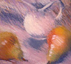
Geometric composition: The three objects in this pastel drawing together form a slightly asymmetrical triangle.
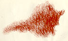
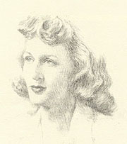
Figure/ground: In this conte drawing of a shell, the shell is the "figure"; the space around it is the "ground."
Nancy Doyle
Fine Art
The "dab" as a structural unit: Since the time of the Impressionists, the dab has sometimes been used in painting as a structural unit, similar to a mosaic.
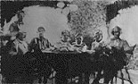
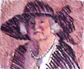
Relationship to the edges of the picture plane: The edges of the artwork need to be considered when placing the image; in this pastel drawing, the woman's hat just barely touches the top and left edges; and the image touches most of the bottom edge.
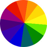
Color wheel: The three primary colors (red, yellow and blue) are equidistant from one another on the color wheel. Their complementary colors (green, purple and orange respectively) are opposite them on the wheel, as are the complementaries of all the other colors, for example, yellow-green opposite violet.
View Robert Rauschenberg's work to see an example of the contemporary space in his paintings (also his use of contemporary imagery). This link is located at www.artchive.com, where Mark Harden does scans of artwork with amazing clarity and resolution.