Evolution of a Painting
As an artist, I have returned to painting after a long absence, and I'm starting with the simple classical still life. I'd already done five pastels before I started this oil painting, and am documenting my progress on this page. When I started the painting below, I decided to take a photo of it at the end of each session, as a learning opportunity for art students.
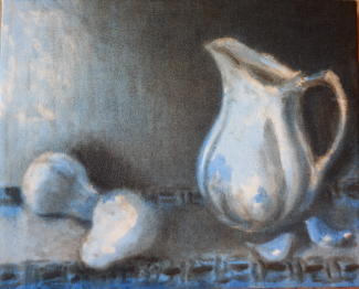
1
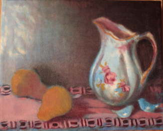
2
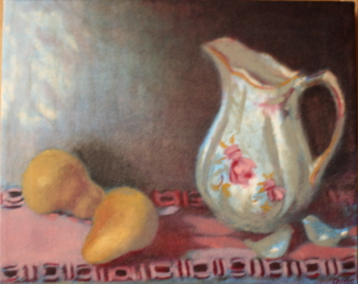
3
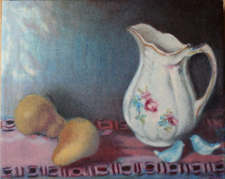
4
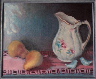
In this 11" x 14" oil painting, I started by blocking out the simple forms with a sepia color, which I thought would be a warm purplish-brown. Unfortunately, it turned out to be a neutral gray-black, so after letting it dry for a few days, I went back over it with Sennelier blue. Both colors were applied as a wash. I particularly wanted the background wall to be a warm brown color, and for the cloth to be pink, but I added blue everywhere, even to the pears, beginning to show their volumes. I had planned this painting as the sixth piece in a series of simple still lifes, as part of my back-to-basic regimen to recover my rusty skills. I was going to enter an art show with the theme of honoring great artists of the past, so I chose the early work of Cezanne as my model. His early work is characterized by strong frontal volumes, bold contrast of dark and light, and grayed-out blues and reds.
In the second session, I added a wash of alizarin crimson to many areas in the painting, still trying to create the warm purplish-brown for the wall, as well as yellow ochre pale to the pears and pitcher. This application created mixtures of color on the canvas, rather than on the palette, such as the alizarin crimson wash over the pale yellow ochre pears. I wanted to create warm areas in the painting, to contrast the cool blue and dark gray. Unfortunately, the alizarin crimson (which is a strong pigment) overtook the painting, so I went back with a cloth to wipe some of it from the wall, allowing the blue to show more on the left side. I had accidentally left some of the wall empty on the left, and liked it as it seemed to indicate light from a window, so I left it that way. I left the upper right corner as a dark area to contrast with the white pitcher, and continue the idea of light coming from the left.
For the third session, I added a warm and a cool gray to the pitcher, the pear on the right, and the birds. I also added more yellow ochre pale to the pears to lighten them and show their volume. I also wanted more of a warm color in the painting. I also made a reddish-brown with the sepia, yellow ochre pale and alizarin crimson, and used it to warm up some of the cloth, the area behind the birds, and the gold markings on the pitcher. I also tried to correct some of the perspective on the cloth pattern, but left it somewhat untouched, as Cezanne often flattened his perspective.
For the fourth session, I added more light blue to the wall, as I felt this looked better with a cool tone, and re-added blue to the birds and to the pitcher flowers. I also used alizarin crimson again to touch up areas, such as the cloth pattern between the pears and pitcher against the wall, as I felt it was too bright and came forward in space too much. I also added alizarin crimson to the pears, and a lighter yellow to the front pear as light coming from the window.
When this all dried, I added a cream color to the pitcher, and a dark red-brown to the gold trimming around the top. I added blue to the birds again, and a light highlight on the pink cloth on the left.
5
For the fifth session, I refined many small areas in the painting, such as adding a darker mix of blue and alizarin crimson to the wall, the cloth pattern between the pears and pitcher (against the wall), under the front pear, behind the birds, in the cloth pattern along the front, and behind the pitcher on the right side. I also added a soft green to the pitcher decoration, a warm peach color to highlights on the pitcher, and a cool light gray on the birds. I added more blue also to the bottom of the canvas.
This way of working - modelling the forms by blending the colors together - is the way I painted when I first began almost 60 years ago. After I graduated from art school, I began to use the broken color technique of Cezanne and the Impressionists, as well as their color palette of yellow, red, blue, green and violet, which is very different from this painting. It was hard for me to go back to the patient modelling technique - it tested my patience. I am starting at the beginning to try to recover my painting mojo after a 9-year absence from painting, caused by family obligations. It is a slow road, but I'm hoping that in a year or so I will have recovered most of my skills. You can see what my "real" work looks like here.

Nancy Doyle
Fine Art