A certain amount of drawing is mechanical in nature; that is, it is done more on the conscious level, and even in the left, or analytical, side of the brain. Therefore, this part is a little easier and faster to learn, because it consists of practical, more easily comprehended steps. And it involves manual dexterity, eye/hand coordination, and simple practice; and is more objective, less subjective. It comes in handy for those who are interested mainly in accurate depictions of people and objects - likeness, correct proportions, and other quantitative measurements.
The first three drawing exercises here dealt with specific types of drawing methods and visual elements - line, mass and gesture. This lesson is concerned with loosely combining the characteristics of the three above-listed exercises, in a more personal and spontaneous way. One can, for instance, when sketching from life, start with a gesture drawing of the object or figure, to get the main action and movement, or line of axis through the figure or object. As the subject is gradually and lightly massed in, one can then start to define more with line. When the subject is more established, one can then begin shading of light and dark tones, if this is desired in the drawing. There is no one correct way to draw - and as you increase your drawing practice, you will undoubtedly create your own individual style, improve through trial and error, and even come across new possibilities by accident.
Getting an exact likeness of the subject is not the usual main purpose in art. Unless a camera is used, a perfect likeness is not even possible. The naturalistic preoccupations of the Renaissance, and those of some artists since, comprise a relatively brief period in the history of art. Most cultures throughout the rest of history have produced art concerned with other intentions than versimilitude, whether for religious, political, aesthetic, or personal reasons. Since the camera was invented, the exact likeness produced by an artist has become unnecessary, freeing the artist to once again try to explore more profound concerns than capturing outward appearances.
For the last 20 or so years, the trend in art school education has been to de-emphasize the academic approach to drawing, and instead concentrate more on the conceptual process involved in art-making - on ideas rather than on developing the eye and hand in the traditional way. This is probably due to the influence of the Conceptual art movement on contemporary art. While I agree that drawing should not be a mastery of one's technique with manual dexterity, I also feel that beginning students can benefit from traditional drawing study, which trains the eye to see - and this in turn enables students to cast a critical eye on their own and others' work, and to discern the visual processes in all artworks.
When beginning to draw, remember that all artists start from scratch. If you look at the first works of Van Gogh (down the page, drawing done in 1880), you can see that he did not have what is referred to as 'facility' - in other words, it did not come easily to him. He struggled, and I think the struggle caused him to produce work that is not only great, but totally original and new at the time created. Other important advice: follow your heart in art. Draw what you love and know - whether it be flowers, geological formations, machinery, your family and friends, food, outer space, animals, etc., in addition to the traditional subjects. Your progress will be much faster. Also, copy drawings of old and modern masters - da Vinci, Van Gogh, Cezanne, Larry Rivers, Michelangelo, Seurat, Durer, Rodin, Redon (down the page) and others.
Practical Information:
Drawing Materials - First, use the best type of tool for your purpose. There are two types of drawing pencils - soft and hard. Hard pencils (2H, 3H, etc.) are good for fine, precise line drawings. Soft pencils (2,3,4,5, or 6B - the higher the number, the softer the pencil) are better for fine art or expressive drawing. They can be erased with kneaded erasers to correct the drawing, and also for expressive purposes. Felt tip pen and ballpoint pen are good for fine art line drawing. Charcoal can be used for less precise drawing. It comes in hard (compressed), or soft (thin vine or up to almost 1/2" wide). This can be smudged or erased with a kneaded eraser, as well as the fingers or a chamois cloth. There are also conte crayons, which are harder than charcoal, and which come in various earth tones. There are many kinds of drawing paper available - from cheap newsprint pads to high-quality drawing paper, such as Strathmore 400. Beginning students can use cheap paper for dry drawing work, such as newsprint or cheaper "sketch" pads. Pastels can also be a good drawing tool, working in color. Pastel pencils are better for finer control, and soft or hard pastel sticks are better for looser work, such as Degas produced. These can be bought individually or in sets of 10 up to 120 or so, at varying quality and prices. Rembrandt, Sennelier and Grumbacher are good brands to use. There is special paper for charcoal and pastels, which comes in many colors, and has a texture which captures the small charcoal or pastel pigment. Oil pastels are also used for color drawing - they are harder and more like crayons than regular pastels are. One can also work in ink, with a brush or pen. There are varying types of ink pens available; and also brushes, which come in different sizes and styles. A good brush for beginning students is a bamboo-handled Chinese watercolor brush, used with ink on rice paper or water color paper. One end of the Chinese brush has a point for ink drawing, and the other end has a brush. Ink comes in black, and also in many colors. Art supply manufacturers are always coming out with new products to try. Winsor & Newton is a great brand to use; also, Rembrandt, Van Gogh; Grumbacher is usually cheaper.
Holding the Drawing Tool - The way the tool is held is very important in drawing. It is usually better to hold it very loosely in the fingers - in the usual way, but with the thumb and first two fingers 2 or more inches above the point. Even better is to have the thumb and first two fingers in a more straightened out position, palm facing down. With a piece of charcoal or pastel, a good way is to hold the tool between the thumb and all of the fingers, palm down. These last two positions make it easier to use cross-hatching, which is a good way to do shading of lights and darks (chiaroscuro). Although it is OK to draw with the hand in some cases, it is usually better to draw not just with your hand, but with your arm itself. Especially when you are standing to draw at an easel, this lends itself to a looser way of working. Also, you can then see the drawing from more of a distance away, which is good for checking proportions, and progress in general.
Checking Vertical and Horizontal Relationships - When you are drawing a figure or subject from life, or drawing a building or tree outside, a good way to see vertical relationships is to use a plumb bob. This is a metal object about 2 inches long which suspends from a string. When the other end of the string is held, the plumb bob will hang straight, due to gravity. When the end of the string is held by the outstretched hand, you can judge the relative verticality of the lines in the subject compared to the plumb bob. This is a traditional academic method of ascertaining the angles of the subject - the angle of leaning of the figure, the angle of the arms and legs of the figure as compared to the perfectly vertical line, etc. It is almost as accurate to use a pencil held in the fingers at arm's length between the subject and your eyes, and simpler. For horizontal relationships, just hold the pencil horizontally, and you can see, for instance, at what angle the edge of a ship's sail is in relation to the horizontal - 45 degrees, 90 degrees, etc. This is good when appearances can tend to be deceiving, which is often; for instance, if you are drawing the interior of a room, and you want to see the angle at which the ceiling lines move away from you. The vertical lines of a building will always be vertical (except for the Leaning Tower of Pisa), but the horizontals receding in perspective will vary, and can be tricky to ascertain, particularly from below. When you hold your pencil horizontally to compare it against the receding ceiling line, sometimes it is surprising to learn that the ceiling line goes downhill as it gets further away from you, and horizontal lines of the building or a table will not be straight horizontally unless you are facing them squarely head-on. If you are even slightly at an angle to the floor or ceiling line, or table edge, that line will appear to be tilted, not straight horizontally. When drawing, sometimes you need to forget what you "know," in order to depict the subject as it really appears - leave all your preconceptions behind.
Shading of Lights and Darks - When drawing or painting, one way to show the three-dimensionality of the subject is to shade the light and dark areas, also known as tones, or values. When working in black-and-white or color, subjects have varying values of light and dark, on a scale from white to black, or grayscale. There are an infinite number of gradations between white and black. Geometric objects, like a cube, will have more sharply defined areas of differing tones, depending on the amount and types of light in a room. These will have a smaller number of tones represented, and these will have sharper edges of tones. Natural objects, on the other hand, can have an endless number of tones represented, and these will often have softer, less defined edges. Tones can be represented by a smooth tone, with no texture, for instance, of a cube. For natural objects, the forms can be represented by gradation in a smooth, gradual fashion, or with various forms of textured shading. The most widely known of these is cross-hatching, which is more or less closely spaced, sets of parallel lines in one or more directions. The more closely spaced the parallel lines are, the darker the tone; also, the number of layers of lines of opposing directions can determine how dark the tone becomes. These directional layers can be at right angles to one another, or they can be at oblique angles to one another; they can be very carefully delineated, or they can be quickly and casually put in place - probably the latter manner is more common. Especially in the art of the 20th century and forward, cross-hatching has become a very flexible, personal and spontaneous extension of the artist's personality, mood, etc., and can be quite lively and various - with a lot of energy and expressiveness, as opposed to deliberate and formulaic. This spontaneity has become associated with a certain authenticity or conviction, rather than proceeding with technique only, as in a mannered style, which is done only out of habit, or lack of conviction. However, the deliberateness can also be associated with a certain cerebral quality of some contemporary art - a kind of impersonal statement.
To depict a simple object such as a cube, only a few tonal values might be necessary: the side which receives the most light being the lightest, the side furthest from the light source (the darkest), and one or two middle gray tones for the sides which receive an in-between or indirect amount of light. With rounded objects, at the brightest (often highest) area, there is the lightest value, which gradually darkens as the object recedes from the light source, in an often irregular fashion. The areas of light and dark tones will usually follow the form of the object - on a sphere, the areas will be rounded or circular; on a face, the areas will follow the form of the face, etc. When depicting light and dark tones, artists usually do so by indicating the parts of the form in light and the parts in shadow. Most of the time, this will serve to represent the form depicted. However, there are times when the information presented in the subject will not represent the form depicted accurately - for example, if you are looking at a spherical object, which has a cast shadow of a straight, or geometric object on it, like a piece of paper held horizontally. This may cast a shadow that looks like a straight line on the sphere. If this shadow causes the form of the sphere to appear as a flattened surface, then the artist must choose between light, and the form itself - in other words, between what he/she knows and what he/she sees. Most of the time in this situation, artists will choose the more true representation, that of the primacy of the form, rather than light, which is really an optical illusion in an instance like this - that the sphere is not rounded, but flat. It can also be distracting for the viewer, who knows that the form is a sphere, to see a straight linear shadow across it. However, if you aren't working in a realistic way, you might want to keep the straight line in the sphere, to flatten it.
I recommend that you first read Art Instruction, to get the full benefit of this exercise.
There are other ways to express light and dark values, especially in art of the last 100 years or more. For instance, in his ink drawings, Van Gogh used individual marks spaced closely or further apart to indicate values, from the influence of Impressionism. These marks also produce an interesting texture in a drawing or painting. Marks can be very individual for each artist; and it can be good to develop a vocabulary of marks to use in your work. Look at the work of modern and contemporary artists for possibilities in the use of various marks.
Related to this are the different approaches to form of the 19th century and 20th century. In the late 19th century, artists began to veer away from the traditional sense of three-dimensional form perfected during the Renaissance. This began around 1850, with Manet's break from conventional modeling of forms and blended paint strokes, and continued with Impressionism and Post-Impressionism. Artists began to focus on the canvas as a flat surface, the pictorial surface, as opposed to the illusion of depth. Examples of this new vision are Gauguin, Van Gogh, Vuilliard, and others, influenced by Japanese prints, the invention of the camera, and other factors. This new flat pictorial space coincided with artists' awareness of painting as an arrangement of forms and colors on a flat surface, much like music is a composed arrangement of notes, etc. Forms and colors have their own identity separate from what objects they represented - their 'abstract' identity. The representation of form took a backseat to color, light, emotion, spirit, expression. Cezanne, a Post-Impressionist, had a slight variation of this idea - he 'combined' the traditional three-dimensional depiction of form with the new flat surface, paving the way for Cubism and other new visions of form and space in the 20th century. This affected all serious art since that time, so that now conventional representation of form through light and dark is seen less often than the contemporary flat surface in art. Still, values are still used - just not as much in the service of the representation of form - they become elements of the work as abstract light and dark values, whether the painting/drawing is realistic or non-objective, in addition to line, color, shape, and other elements of an artwork.
In this sense, the word 'detail' means something different from representing every aspect of every object, etc. It means that every single relationship is considered by the artist, either beforehand or after drawing - relationships of color, line, space, shape, size, texture, composition, etc., and that the work is not 'finished' until the relationships work as perfectly as possible together in a unified whole. This means that the work will have balance (often asymmetrical); harmony (without being too bland or decorative); movement (and countermovement); logical spatial relationships (not necessarily in Renaissance perspective); color relationships that work (but not in the limited sense of interior design); logical tonal relationships (not necessarily of form represented in three dimensions), etc.
When drawing objects, you will be determining their linear structure in space. As such, you will need to discover their identity apart from their identity as objects in the real world - such as table, flower, head, etc. (their abstract identity). It helps in learning to see forms objectively to "forget" what an object is, and to concentrate only in it as a form in space - how wide or tall it is, what angle it leans to, what tone it has in relation to light and dark, how close it is in space, etc. All these attributes are relative - wider than what? taller than what? lighter or darker than what? closer or further away than what? - within the work. Discovering these relationships and representing them is what figurative drawing and painting are about.
More Practical Tips on Drawing:
1. Try to work in larger sizes and different types of paper. 18" x 24" is a good size for a beginner; it will seem very large at first - but you'll get comfortable with it, and soon the small sizes will seem too small for you. Try charcoal and pastel papers, rice papers, and the many kinds in the art supply store or online.
2. When working on a longer study, leaving it and coming back later can help you see it fresh - the parts that work and those that don't.
3. Try to work on the whole drawing at once - as opposed to starting in one place and going from there - establish the main structure, main movement, etc., as described in the previous lessons in contour, mass and gesture drawing.
4. When trying to get the correct proportions, try comparing relationships in size between forms and parts of forms, in units of measurement, with your eye. For example, the vase is 1 unit wide, 2 units high, etc. (twice as high as wide). If you compare all the relationships this way, you can find the correct proportions. A similar method can be applied to determining the angles of objects - what are they in relation to a right angle, or 90 degrees?
6. You don't need to define the subject with only one, correct line. There can be two or more, loosely defined lines to define the contour of an object or figure. For example, in Cezanne's figure drawings (near the bottom of the page) - there is a searching, sketchy quality to them, and this searching quality and multiple contours give his figures an expressiveness, and actually contribute to their sense of three-dimensional form, since they convey the reality that the figures are not flat, with a hard outline, but continue in three dimensions behind the contour line.
7. Correcting proportions and relationships: You can perfect the proportions of, and relationships among, the object(s) you are drawing by comparing them visually. This can be done by systematically comparing the locations of forms; in a figure, for instance, you can compare the positions of the elbows - which is higher? Are they located within the figure, or are they to the left or right of the figure's contours? In a landscape, is the lower edge of a tree trunk higher or lower than a patch of flowers? etc. This can seem tedious, comparing all forms to all the others - but it works!
8. Work mostly from life, as opposed to photographs - especially when a beginning student. Continue this way for many years. Without this study from life, one's drawings will lack a convincing awareness of depth and movement, as well as spontaneity, or vitality.
Having said this, I'd like to say that I feel occasional working from photographs is OK, particularly when one has had much experience drawing from life. There is a certain amount of disagreement about this, but in experienced hands, there is not much difference between using photos and not using them. Both consist of observing the subject; and photographs can bring the possibility of sustained study indoors that landscape artists appreciate, as well as viewing subjects from many angles, or from an angle that might be impossible in real life - i.e., from the middle of a highway, or from a telescope lens into the heavens. And there is an exercise that is good for beginning students which uses a black and white photograph as a source, which actually helps in the awareness of the abstract identity of forms - their tonal values, etc.
Exercise: Drawing from a Photograph
Find a black and white photograph (newspaper is OK) which has a good range of white to black values, and an interesting variety of shapes, without too many flat or empty spaces in it. Take a pencil or pen, and measure a grid of approximately 1" squares across the entire photo, marking out the lines with your pen. Then take a piece of white or off-white drawing paper and measure a piece of the paper that has exactly the same proportions as your photo (For example: if your photo is 4" wide by 6" high, measure a piece of paper whose side is 2/3 the size of its height - 12" x 18", for instance.) Then, mark the same number of grid lines on your drawing paper as are on the photo, so that there are the same number of squares on each.
Now, square by square, copy with a soft drawing pencil (4B is good) the values and shapes you see in the photo. It helps to "forget" what the subject of the photo is - just think in terms of the lights and darks, and their shapes, that you see, and transcribe these as best you can, by copying the photo square to the paper square. Think: This white shape starts on the upper right edge of the square, about a quarter of the way down, gets wider as it goes down to the bottom right of the square, then gets thin suddenly and turns to the left, curving down to the bottom of the square, in the middle of the bottom of the square. You can start shading lightly, until you are sure of the drawing; and try to see as many subtle gradations of white to black as possible, even in tiny variations within shapes. Once you begin seeing things in terms of their tonal value, and abstract shapes, you can begin to depict things as they appear - objectively. This is learning to grasp the abstract identity of forms - and is essential to being able to draw well - and starting the process of head, eye and hand working together. The American artist, Chuck Close, did similar photo-realistic studies of himself in black and white in the late 1960's and early 1970's - scrutinizing every little hair on his head. These grid drawings are fun to do, and you can get some interesting results, as well as learning from them.
The process of learning to draw is reciprocal: one observes forms, and one's observational skills improve; when one's perceptual skills increase, one can in turn observe more closely. You will find yourself noticing all kinds of things you never really looked at before. It really is a magical process, that is self-perpetuating, and self-absorbing. It certainly can be frustrating - I can remember many hours in life drawing class, where I just couldn't "see" what the figure was doing. The teacher would come along and point out right away where my drawing was off - it was such a mystery to me how he could see and I couldn't, and I wondered if I would ever be able to see as well as he. Well, I can see pretty well now - but I still struggle sometimes with correct proportions, etc. I just force myself to measure the relationships mechanically. It takes this kind of determination to stick it out over time, and really learn to see. But the rewards come. And then you realize that correct drawing is only a means to an end, not an end in itself - the goal is really self-expression, and by doing that, hopefully your expression will also be universal.
5. Work in different materials, such as charcoal, and ink with brush. They each have their own unique qualities, and can add breadth to your experience. Charcoal is good because you can quickly and easily alter your drawing with kneaded eraser, fingers or chamois cloth, or start over; or you can build up your darks gradually into a rich blackness. Ink and brush are good for the expressive line of varying width.
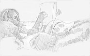
This is one of my student sketches. Note how you can still see the traces of my first lines defining the central axis of the figure.
There is one online drawing by Cezanne (near the bottom of the page) that illustrates the use of more than one contour line in drawing. And there are two drawing books which illustrate many concepts:
The Natural Way to Draw, by Kimon Nicolaides, Houghton Mifflin Company, Boston, 1941.
Drawing on the Right Side of the Brain, by Betty Edwards, J.P. Tarcher, Inc., Los Angeles, CA, Distributed by Houghton Mifflin Company, Boston, 1979.
In particular, look at drawings by Giorgio Morandi, in Betty Edwards' book, a pen and ink still life of bottles, which is a great display of cross-hatching. And Van Gogh's ink drawings, which use post-Impressionist "marks" to indicate texture. A contemporary Pop artist, Larry Rivers, is also a great draftsman. Looking at Rembrandt's and Cezanne's drawings is also very helpful. Both books listed above have a lot of great illustrations.