In painting, the formal elements are composition, space and color. The elements used in creating pictures are mark, line, shape, color, value, texture, and space (the pictorial elements), which are described in more detail below. The pictorial principles, which are described in Design V, are balance, contrast, harmony, emphasis, movement, proportion, variety, and unity. Artists may concentrate on some of these elements and principles more than others.
Some of the main design functions include: 1) leading the viewer's eye around and through the painting (and not out of it); 2) stabilizing the composition with checks and balances, neutralizing of elements; 3) directional movement created by elements; 4) considering the total space (positive and negative). Some of the ingredients include: 1) the linear structure of forms, that is, the underlying geometric structure of objects, like the rectangles and cubes, and vertical, horizontal and diagonal lines involved in tables, buildings, chairs, etc.; 2) viewpoint - either with 2-point linear perspective, atmospheric perspective, or a contemporary "flat" image; 3) straight lines and curves (types of curves include linear, gestural, baroque, organic, biomorphic); 4) structural geometric forms used as underlying compositional elements to stabilize the composition, such as a triangle, or the upside-down 'Y' structure of Illustration 1.
The pictorial elements of mark, line, shape, color, value, texture and space can all be used as unifying factors in a two-dimensional image. Starting in the 16th and 17th centuries, painters started to be aware of how they could use these elements to create harmony, balance, and continuity in an image, for instance with the distribution of lights and darks (value, or chiaroscuro). This continuity enables the viewer's eye to move across the image in a fluid manner, and can be accomplished in many ways using the pictorial elements. The Impressionists used light and color as unifying factors in many of their works, changing from the previous dependence on value to perform the same function. Painters such as Rembrandt and Rubens also eliminated some of the contours in their forms, allowing visual movement from one form to another, through the image. This way of allowing movement between forms is called using 'open' forms, and is usually seen more in painterly images - that is, which are concerned more with mass and color, rather than line and value. (Hard and fast contours are usually associated with drawing, and classical art; loose shapes with little use of line, and more use of color and painting, are what used to be called 'Romantic,' and are associated more with painting. The former (Classical) is concerned with harmony, order; the latter (Romantic) being more concerned with passion, emotion. These divisions of Classical and Romantic are more associated with the 19th century than with the 20th; now perhaps it could be called cerebral (see bottom half of page) versus emotional, drawing versus painting.
Contemporary art, in general, is somewhat less concerned with formal elements and principles than in the past. It seems like after the formal experimentation and rigor of the first half of the 20th century, painters became more interested in expressive possibilities, perhaps feeling that "everything had been done," with the formalism of Cubism, non-objective art, and other ism's. Now, it seems the content, or meaning, of the artwork has become more important than formal credentials. With Conceptual art, the visual component of art is often not even present, being more strictly an idea than a visual work. However, presented below are some general "rules" about good composition - meant as suggestions, however, since there are always many exceptions to any rule, even in great works of art.
Specific Design Guidelines:
- Try to keep the viewer's eye from exiting the painting; with your arrangement of elements, learn to lead the eye around and through the image in an interesting fashion. If this directional movement does leave the painting temporarily, bring it back in nearby, for instance, if a line goes "off the edge," have it come back in nearby. (See Illustration 1 and Guidelines, on left and below) (Note: In painting pre-1850, the image was contained within the frame; however, with Manet and the Impressionists, such as Berthe Morisot (some images on this page are by Manet, and some by Morisot), mages began to be more casually placed. Photography influenced painting, with its snapshot effects of figures accidentally being cut off at the edges, etc., and the feeling that the image continues beyond the edges of the picture. Modern and contemporary art have expanded on this notion, with the flat space often feeling like it extends beyond the edges (frame) of the painting.)
- Vertical and horizontal elements (lines, shapes) have a feeling of calm and order. Diagonals, on the other hand, are more dynamic and suggestive of movement.
- Generally, elements or forms should not be placed in the center of the picture surface, either vertically or horizontally, because this tends to divide the image in half. (This includes the horizon line in a landscape, or the back edge of the table in a still life, for instance.) There are exceptions to this rule, however, especially if other elements are designed to offset this centering. For instance, da Vinci did an ink drawing of a copse of trees, which was centered with mostly empty white space around it. However, he did two things to counter the central placement: he placed the image just slightly off-center; and he made the image of tiny ink lines without contours at the edges of the image, so that the white areas between the lines were visually linked to the white surrounding negative space. This allowed the positive and negative spaces to be connected, and thus unified, without the awkwardness of plain central placement cut off from the 'background.'
- The design should be balanced, without being symmetrical - this is called asymmetrical balance (also called dynamic asymmetry). An example of this is: an image of two identical bottles, one on the left side, and one on the right, is symmetry. One tall bottle on the left, and two small bottles on the right is asymmetrical balance. This creates more visual interest than a symmetry of left and right, or top and bottom.
- The "weight" of elements in a work, such as shapes or forms, generally should be toward the lower part of the canvas (i.e., not top-heavy). However, there are many exceptions to this, especially in contemporary art.
- Diagonals, especially in the lower part of the image, lead the viewer's eye into the space of the painting. This is particularly true of traditional painting, where the diagonal used might be a road or other means into the distance, as with linear perspective.
- Often, an odd number of forms (as opposed to an even number) creates a more interesting, less symmetrical, arrangement (i.e., five objects instead of four).
- Generally, the "weight" of forms should be somewhat equitably distributed, as opposed to all being lumped into one area. There are exceptions, of course. Empty space can also have weight; if done knowledgeably, a lot of "empty" space on one side can balance a form on the other side.
- The composition should ideally be derived from and based on the meaning of the work, from the artist's 'inner necessity,' whether the image has a subject (traditional) or is non-objective (contemporary).
- Areas of difference between traditional and contemporary painting:
- Architectural structure: In images, there is usually an underlying structure, composed of geometric (straight or rectilinear) and/or curvilinear (curved) elements, whether the image is abstract or realistic. In realistic images, the structure will be underlying the objects - whether trees or still life objects. In contemporary abstract or non-objective images, this structure will be the actual forms used in the image - squares, spheres, etc., and sometimes this structure will be the actual subject matter of the contemporary image.
- Perspective: In traditional art, linear or atmospheric perspective (see photograph below) are generally used. In contemporary, flat images, the illusion of distance is generally not considered as important.
- Shading/modeling: In traditional images, the shading of lights and darks (chiaroscuro) is often used, however in contemporary work there is more emphasis on flatness. Also, in traditional work, areas and colors tend to be blended together more smoothly; in contemporary work, there is more use of 'broken' dabs of color, not blended together very much.
- Line/mass: In traditional work, there is often more emphasis on line, or drawing, and also on lights and darks (value). In art since the mid-19th century, the tendency has been toward a more 'painterly' image, of mass/shape over line, and color over value.
- Focal point: In traditional art, there is often a focal point, or center of interest; in contemporary work, there is more equal distribution of emphasis, even to the point of an 'all-over' distribution, like Jackson Pollock's "drip" paintings.
Specific Pictorial Elements: (These are not separate, but are all interrelated in the image)
Mark - A mark is the smallest and most basic element - it could be a dot, dab, comma shape, patch, squiggle, calligraphic mark, or small square. Often it is the personal 'handwriting' of the artist, that can be natural or learned. These can vary in size, value, regularity or irregularity, and can be used alone or as a unit in a group which forms a line or shape in the image. Marks can be used to form a value or pattern (placed close together forms a darker value, further apart forms a lighter value), or to delineate space (larger means closer, etc.). A good example of the use of marks is the ink drawings of Van Gogh. The Impressionist painters used what could be called patches; and the Pointillists, such as Seurat, used the dot.
Line - Lines can be straight, curved, or organic, and can vary in thickness (weight), and value. They can be very important in providing directional movement in the work, leading the eye through the image. Together, they can form shapes, patterns, and texture, and can help lead the eye (through perspective, for instance) back into space in a landscape or other image. They can form empty or filled shapes. A classical example of the use of line is the painter Ingres, who also did wonderful line drawing portraits. Lines, or strokes, can be used in hatching and cross-hatching to shade forms. (Hatching is a series of parallel lines in one direction; cross-hatching is another series of parallel lines superimposed over the first series, in a different direction than the first.) As well as shading, these cross-hatched strokes can also provide directional movement in a work. When there is one layer of parallel lines, the movement will be the direction the lines are pointing; when a perpendicular second set is put on top of the first set, this can neutralize the directional movement of the first set, and cause an all-over movement, rather than just one direction. Unity in an image can be obtained by the orchestration of these strokes, in one direction, two or more, or in an all-over manner.
Shape/mass - Shapes or masses can be organic or geometric in nature, and can be solid or empty. They can be used alone, or as units in another, larger shape. They can also form patterns, and be used in the division of space in an image (their placement divides up the picture surface), and distribute the "weight" in an image. They also can vary in size, which helps to establish spatial depth; and in value (light or dark) or color. Using similar shapes can help unify a composition; varying the shapes adds variety and interest. There is an effect used by many artists, called counterchange, meaning where there are areas of dark shapes on a light area, and nearby areas of light shapes on a dark area. Monetused this effect often, such as where there might be dark leaves against a light sky, and nearby there would be light leaves against a darker area. Visually, this is very interesting, particularly to another painter, who might be apt to notice it. It also helps give a sense of spatial depth, of receding and coming forward.
Color - (See Design III for more information on warm and cool colors, color wheel and complementary colors.) An important element, color can be used to create color harmonies, contrasts, unity and variety in images, as well as delineate space (colors tend to come forward or recede in space, relative to one another). Color is affected by light - and color can help portray light, as the Impressionists found. Since the mid-19th century, color has generally been more important to painters than value (lights and darks). The three primary colors are red, blue, and yellow; secondary colors are green, violet and orange. Colors have different intensities (rich and weak), and values. The term 'hue' means the actual color, like red, green, etc. Complementary colors are those that are opposite each other on the color wheel; when placed next to one another they make one another appear brighter (red and green, yellow and purple, orange and blue); mixed together, they can form neutral colors (neither warm nor cool). Generally, warm colors are those with more yellow in them; cool colors generally have more blue in them. But the most important thing about colors is that they affect each other greatly, and colors appear to change relative to what color(s) are around them, in an often unpredictable manner, forming optical illusions at times. Josef Albers, in his book Interaction of Color, presented exercises to show these effects. (See Illustration 2 below) When mixing colors, a painter can achieve unity and contrast (using color harmonies of adjacent colors on the color wheel, and mixing a color common to others, i.e., adding a certain color to most other colors, will help produce unity; contrast can be created by using colors far away, or opposite, one another on the color wheel.) Color can also be used to create a mood or emotional quality, with varying intensities and hues, and combinations of colors, such as garish yellows and greens, deep blues and purples, etc. Color can be applied traditionally, in blended areas, or in a "broken" manner, like the Impressionists, in dabs or patches of unblended color. Blended colors and tones generally appear in work which attempts to depict the illusion of depth and three-dimensional modeling, whereas broken color appears in work done after 1850, through the period of early modernism. Both ways of working can still be seen in painters who paint either traditionally or impressionistically/expressionistically.
Value (light and dark) - Lights and darks are used in shading and modeling of forms in traditional art, as well as to delineate space; in traditional and contemporary art, they are also used as spatial cues, where areas of most contrast (dark and light) seem to come forward in space. Value can be created with tones (flat shapes/areas of light and dark), lines (the closer the lines, the darker the value), marks (same as lines). Compositions can be unified with orchestrated distribution of lights and darks, and directional movement can also be directed with values, in smooth transition or abrupt changes. Colors have values of varying lightness and darkness; it takes a little practice to see these values separately from the color identity sometimes - squinting can help. Value, as color, is also relative - when something is dark, it is dark in relation to something else which is lighter; 'dark' in itself doesn't indicate the actual darkness. That is, a medium dark object, when placed next to a black object, will appear lighter, but next to a lighter tone will appear darker.
Texture - Literally, texture refers to a repeated pattern seen in some materials - fur on an animal, weave in a fabric, etc., as represented in an image. In two-dimensional images, however, texture also means the pattern seen in the actual visual elements used - a patterning of dots, lines, shapes, etc. Visual textures can vary in value (patterns of close marks appear darker than marks further apart); in space (if a textural pattern varies in value or closeness, so it appears to be closer or further away in space, or modeled or flat). Visual textures are created with repetition of various kinds of marks or images; in modern and contemporary art, visual textures have been used in a 'flat' type of composition, that is, not illusional space, like previous art had been. Specifically, frottage (rubbings) and collage (pasted paper and other materials) made great use of visual textures in images, such as those by Max Ernst, the Surrealist artist. Van Gogh also made great use of texture in his ink drawings, particularly of landscapes. The use of texture in patterns and repetition can also form visual rhythms in an image, as in music, with same or varying intervals between marks in a pattern. Visual texture can add a great deal of interest and dynamic energy to images.
Space - Last, but not least, is the concept of space, which is a complex element. See Design II for the history and types of space, and Design III for guidelines and spatial concepts. Briefly, many types of space have been used throughout the history of art - "primitive," Renaissance, Impressionist, modern (both more flat), Cezanne's combination of Renaissance and modern, and late modern "allover" space (as in Pollock's drip paintings) More traditional images use linear and/or atmospheric perspective to depict the illusion of spatial depth in images, i.e., parallel lines appearing to meet in the distance, and forms and colors becoming less distinct and more faded as they recede in space, respectively. Traditional, modern and contemporary images also use spatial cues to indicate spatial depth, even with abstract or non-objective work, although modern and contemporary work does not often use linear perspective, and is generally less interested in depicting "real" space. These artists are often more interested in the "flat" reality of the picture surface, or picture plane, than in the imitation of "real" space. This essential flatness, or "integrity" of the picture surface, has been a dominant idea in two-dimensional art since the second half of the 19th century. What it means is that, although some forms in a painting appear to come forward and others to recede in space, there must also be a strong sense of the two-dimensional surface design, that is, no "holes" in the image. In art prior to 1850, Renaissance spatial systems (linear perspective) were used to create images in real space, and forms were modeled in lights and darks (values) to indicate three dimensions in space. This reliance on value to indicate form and space can lead to dark areas in the image (deeper space), which tend to look like dark "holes" in the picture plane. After Manet, artists began to perceive the picture surface in more two-dimensional terms, and in this case, a dark hole in the image would destroy the sense of flatness in the image. That is one reason why the Impressionists tended not to use the color black, so their images would stay wholly on the picture plane.
In his work, Cezanne developed a space which was the result of combining Renaissance depth with modern flatness. This resulted in images which sort-of strained under the tension between these two pulls, flatness and depth, making his forms almost seem to "buckle" under this tension, and seem simultaneously flat and deep. This is the source of the visual power in his work, and I feel, the emotional power as well. This space that he developed is a major accomplishment - complex and extremely finely tuned, to the point where if one tiny element is altered, the whole image needs to be reconfigured. In his very early work, he used strong colors, including black; but as he studied with Pissarro and learned the new Impressionist approach, black didn't show up in his work very much, due to the "holes" produced, as described in the above paragraph. Since Cezanne, two-dimensional images were profoundly affected by both his new "push and pull" of space, and the Impressionist flatness. These two spatial approaches dominated 20th century art (and still have a strong influence).
Throughout the 20th century, artists continued the progression of the flat picture plane and its variations. With Jackson Pollock's drip paintings of the late 1940's and early 1950's, another new type of space was heralded, the "allover" space. What this means is that now, the entire painting surface was equally important, and located in the picture plane. Up until this point, there tended to be a focal point, or center of interest, in paintings; Pollock introduced an image with no one focal point or center of interest. Where previously, there was positive and negative space (figure and ground - see example below in Exercises), now there was only one continuous image, no part being more important or subordinate. Now, the entire canvas must contain the image, equally. It can also be called infinite space, because it feels not like the space on earth, but more that of the vast space of the universe (which they were just discovering in science at that time). It is "deep" space, but not the same illusion of depth as railroad tracks appearing to converge on the earth. It is continuous, both two-dimensionally and three-dimensionally, integrated, not divided into positive and negative space, or figure and ground. Art since has been affected by Pollock's work in a major way, where the reality of the image doesn't end at the edges of the painting, but appears to continue out on all sides beyond the edges of the work, into infinite space.
Spatial Cues
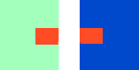
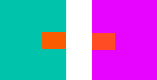
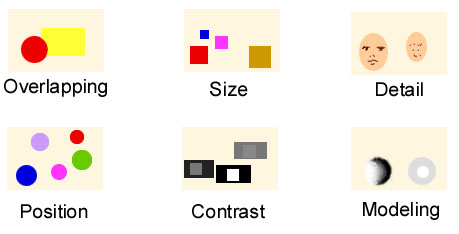
Spatial cues are the means that artists can use to indicate position of forms in space, both in more and less traditional images. They are: decrease in size of forms as they recede in space; positioning closer objects in the lower part of the image, and objects further away in the upper part; having more detail in closer objects; having areas of more value contrast (lights and darks) in the "foreground"; diminishing color intensity as forms recede into space (paler colors); using color to indicate position in space by color interactions (use of complementary or harmonious colors, or warm or cool colors); overlapping of forms to indicate relative positions in space; modeling of forms to indicate three dimensions in space (e.g., shading forms). These cues are used differently in traditional and contemporary art, as traditional artists are more interested in conveying the illusion of spatial depth, and modern and contemporary artists are more interested in the essential flatness of the picture surface, as described above and on other pages of this site. One way to understand this is to look at traditional paintings, by such artists as da Vinci, Jan Vermeer, Canaletto, Ingres, etc.; and at more modern art (Claude Monet, Paul Cezanne, Vincent Van Gogh, Pablo Picasso, Piet Mondrian, etc.); and at modern and contemporary artists (Joan Miro, Jackson Pollock, Hans Hofmann, Robert Rauschenberg, Jasper Johns, Anselm Kiefer, etc.) See Illustration 3 below for examples of spatial cues.
Important Concepts
- To really grasp good composition skills, you need to learn to see forms and images abstractly. This doesn't mean that you will necessarily paint abstract pictures; what it means is that you be able to see the abstract qualities of objects and forms - see their qualities of size, shape, color, value, spatial position, linear structure, etc. - independently of their identities. For example, a teapot in a still life: what is it besides a teapot? It is composed of a spherical form, with curved lips at the top, a slender spout (cylinder) which has a slight curve, and a handle (cylinder) that is a very full, rounded curve. The opening of the spout is an ellipse, not a circle, because it is seen at an angle, rather than from above. The surface of the teapot is shiny and peach-colored; semi-soft reflections can be seen on its surface, which are a pale peach color, almost white. These reflections are a color which is cooler (contains more blue) and lighter in value than the local color of the teapot (peach). The reflections are of the nearby window, with a flowering forsythia bush partially seen, so there are traces of yellow, and a lavender sky in the reflections. The reflections follow the shape of the body of the teapot - the straight line of the window appears as a curve in this reflection. You are looking down on the lidless teapot, which is on a waist-high table, so the top opening appears not as the circular shape it actually is, but as an ellipse, and you do not see the bottom of the teapot from above - the body of the teapot covers it from view. The table the teapot is on is painted a soft lilac blue, and because the peach of the teapot (almost orange) and the blue of the table are complementary colors, they make each other's color appear more intense. (In addition, to help unify the image, you can suggest a little peach color in the table, and a little blue in the teapot.) The table also has reflections from the window, although less clear than those on the teapot, and they show the slight grain of the wood. The teapot casts a shadow in front, which is a deep lilac blue, and is a half-circle in shape. The edges of the shadow are soft, not harsh, and there are two colors in the shadow that are intermediary colors between the pale lilac blue and the deeper blue of the darkest part of the shadow. On the part of the teapot body which is at its most full, the color contrast can be made to appear the greatest, because this will enhance the three-dimensions of the form. Parts of the teapot are in shadow, so they will be varying shades not only of peach and orange, but will have reflections from the blue table, so these will be various combinations of lilac blue and peach, some darker, some lighter, and these gradations, because the teapot is a smooth surface, will be soft and gradual. (Unless you want to be a bold Impressionist or Expressionist, in which case, go for it!)
You have decided to work on a rectangular, horizontal canvas for this still life. (Note: This link and the link below for "vertical canvas" has both horizontal and vertical paintings shown.) The central sphere (teapot) can be placed a little or a lot to the left or right of the image - perhaps close to the right - and take up about 40-60% of the canvas space. The teapot is a little wider than it is tall - so it echoes the "landscape" orientation of the canvas shape, and uses that shape, rather than disregards it, and would present a different possibility if it were as tall as it is wide, presenting then an overall square rather than a rectangle. Vertically, you don't want it smack in the middle, and to add interest (and repeat the spherical shape) you might want to include the shadow of the teapot in the bottom of the picture, perhaps just or almost touching the bottom edge of the canvas. Because the light is coming from the window behind and to the left, the left side of the canvas can be illuminated by this, and you will have a light value on the left, which will contrast with the medium value of the teapot, and the dark value of the teapot shadow. You can also show the window, which will be a straight contrast to the curves of the teapot, and perhaps a tiny bit of the forsythia bush in the window, at the top left of the painting, which will help balance the weight of the teapot on the right. Or, you could have part of the teapot, perhaps the fullest edge of the handle, cut off at the edge. A tall, rectangular vase of flowers would present very different possibilities - a vertical canvas, sharp edges and shadows on the vase, perhaps the vase and flowers would now take up 75% of the canvas space, with perhaps a few fallen petals to visually connect the positive shape (vase and flowers) with the negative shape (table). Are you getting the idea of this visual analysis? You can look at your still life (or other forms) before starting, to try to think of these forms you have in front of you, and how they might be placed. You can start by sketching (with paint) the rough shapes, positions, values, etc., and feel free to alter your original ideas about placement, value, color, etc.; part of the purpose of painting is to discover these relationships, and this usually happens while painting.
- Composing the image according to the format used - The shape and proportions of the surface used determine how the image will be placed on it. That is, a square format will be treated differently than a rectangular format; a circular format will be designed differently than an oval format. If rectangular, the proportions of the sides will also determine the design in that space; e.g., a 9" x 12" format will be composed differently than a 3" x 10" format - the ratios of width to height are vastly different in the two sizes. Circular or oval formats may suggest curvilinear designs; square or rectangular formats may suggest rectilinear (geometric) designs. Practice using different formats for your compositions.
- The use of pattern and repetition in your work is another example of abstracting forms. Though it is tempting to just paint what you see in front of you, you need to learn to be selective in what you choose to paint, and how you choose to paint it. Learn to notice when shapes, colors, values, etc. repeat themselves in the scene before you, and use this to unify and add visual interest to your work. When colors or shapes are echoed, it adds the same thing that metaphor, alliteration, etc. do in poetry; visual metaphor (which includes the iconography the forms might represent, to you, the viewer, or both), and visual echoes (alliteration). Also in music: there are harmonies, there is point, and counterpoint; and theme, and variation; a slight nuance of a color repeated elsewhere in the painting is a visual joy to the eye, like such melodies, harmonies and riffs are in music. Pattern and repetition also enhance the 'sense of surface' - the two-dimensional design in the work.
- "Intangible" elements: Not literally visual elements, but elements of the stuff of life - philosophical elements, if you will - like the element of chance, the accidental, the random, dreams, fantasy, the unconscious, our ancient 'primitive' selves. These ideas were born in the 19th and 20th centuries, when science, psychology and philosophy discovered them, and they were then translated into artistic forms. Dada and Surrealism grabbed ahold of the element of chance - the accident, dreams, the unconscious, the primitive, and fantasy - and used methods to help them tap into these psychic roots. One such method was to create poems by opening a dictionary at random, and combining the words found, often resulting in bizarre, but expressive, poems of poetic juxtaposition, perfectly Surrealistic - eye-opening, thought-provoking, etc., for example 'exquisite corpse,' one example which came to be used as the name of this method. The Abstract Expressionists, particularly Jackson Pollock, used the Surrealist idea of 'automatic writing' to create his 'drip' paintings; they thought that the unconscious would express itself, if they allowed it free rein, without the interference of the 'rational' mind. The Abstract Expressionists were also influenced by the idea of 'primitive,' non-preconceived notions, and Existentialist ideas about the ultimate meaning of life, and the significance of the individual will in the world. It seems that just as the world arrived at modernity (trains, industrialization, urbanization), the romantic notion of returning to our more innocent selves came to the fore, and still exists. After the first World War, dada appeared - in the resultant disillusionment with order, reason, etc. And subsequent 20th century events, like the Holocaust, only sharpened our sense that the world was not an ordered, rational place, like it had seemed up to then. Literature, art and music all produced discordant, non-rational works reflecting this new world view, which had changed so much since the Middle Ages, when everything in the world was divinely ordered and unquestionably certain. The modern world also contained a new notion of randomness, as opposed to divine guidance, in the universe. This notion of randomness and chaos and accident, a discomforting idea, came from discoveries in science (Albert Einstein, for one) of our universe and of subatomic particles, etc., as well as Freud's ideas on the mind. Is the universe ordered or chaotic? How much of our lives is governed by chance? Are we better off for our advanced civilization, or were we living more meaningful lives in times so ancient we can barely remember them? The desire to return to more innocent times seems to be a cyclical idea, reflected in art and music.
Conceptual artists also often include the elements of chance and accident in their work, often reflecting the philosophical underpinnings of these elements. Using chance and accident in art can be a valuable way to learn about composition, and to learn that because something happened by accident doesn't alter its aesthetic value. In my college freshman design class, we did an exercise where we dropped a crumpled piece of white string into a bottle of black India ink. We then pulled out the blackened and wet string, and pressed it between two pieces of white paper, allowing the natural position of the string to determine the resultant image. (We were allowed to move the string before and while pressing, to attempt some control over the design made.) We did this a number of times, and learned to control somewhat how the image would be imprinted. Some very interesting images came of this exercise - the string when pressed produced curved lines and shapes, with some interesting striations of black on white, and the curving movements produced some interesting compositions, and areas of positive and negative. We then chose the three best images and matted them together in one large matte (with a separate matte opening for each). Choosing the best images was instructive, also, about what makes a good composition, and what doesn't. And the lesson that you can get a great image by accident is an important one, aesthetically and philosophically.
- Directional movement: This is a very important part of composition - strictly it is a design principle, rather than an element, but is so important that I will mention it twice. One of the functions of composing an image is to direct the viewer's eye around and through it. This can be accomplished with arrangements of all the elements toward that end, and often comes while working on the painting, as well as planning ahead. Basically, you want to keep the viewer's eye from leaving the image permanently; so, if for instance you have a line which goes off the edge of the painting, you can have it re-enter nearby, as another line, or as a shape/form, etc. In some modern and contemporary work, this concept is not relevant, such as the abstract paintings of squares by Josef Albers or Kasimir Malevich. However, it is used in much traditional, modern and contemporary art. The challenge is to direct the eye in an interesting and effective, and original, manner. This is something that can be studied in many paintings. Erle Loran wrote a book, Cezanne's Compositions, with diagrams analyzing Cezanne's paintings in various ways, including directional movement, which is valuable to students. (See Illustration 1 for an example of one painting's directional movement, and the left side of this page for more examples.) There are innumerable ways to do this - from a geometric structuring like Cezanne's to a curvilinear design such as Matisse's. Of course, for adventurous artists, rules are made to be broken - and the trick is, can you break the rule and still make it "work"? If so, it is a good thing, and many artists have broken this rule, as well as all other rules. Experience will bring the knowledge it takes to break a rule in a workable, even brilliant, fashion. All the elements contribute to the directional movement - line, shape, pattern, texture, value, color, cross-hatching strokes, etc. (See Illustrations 4 and 5 below for examples of directional movement and balance.)
- Modern and contemporary concepts: One modern influence was the invention of photography in the 19th century. It provided artists with a new way to form images, which often appeared more flat than illusions of spatial depth. These images were also often spontaneous, as opposed to designed in advance, giving a new aesthetic of the casual, spontaneous, "snapshot" image, where forms were often cut off at the edges, also an unplanned element of the image. The Impressionists, such as Degas, were profoundly influenced by this new way of looking at things. Equally influential were theJapanese prints imported into France at about the same time; these prints also emphasized the flat compositions favored by Eastern art. The idea of the flat, casual and non-imitative image was largely born of these two influences, which changed the 19th and 20th century art which followed. Another tendency of modern art which influenced composition was the constructive/deconstructive tendency, particularly in the early part of the 20th century. Artistic movements such as Cubism and Deconstructivism aimed to completely rearrange our notions about the static, unaltered image. Cubism fractured forms and pictorial space, rearranging reality to suit the new pictorial reality, and invented the collage, which instead of imitating external reality, became its own tangible reality of pieces of paper, chair caning, etc. Deconstructivism also sought to deconstruct the image, rearranging and reconstructing it with visual principles old and new. The new notion of the transformation of the image in the artist's hands, abstracting and modifying it, to produce new notions of space, form, reality, and aesthetics, has lasted until now. In my freshman design class, we also did an exercise where we cut a magazine photograph into thin, equal vertical strips. We then rearranged the strips, altering the original image, and pasted the new configuration of the strips, with equal spaces between them, onto paper. This is a good exercise in visual and directional movement, and composition in general, as well as the modern notion of the altered image of reality.
A 20th century contemporary example of this transforming of visual reality is the grid. A grid is usually composed of equal squares or rectangles, and can either comprise the image, or be superimposed on it. One example of the use of the grid is in Jasper Johns' early work, where he had an underlying grid in his paintings, and the rectangles in the grid contained numbers from 0 to 9, in many layers of expressive paint, and colors, so that the resultant image was comprised of many small patches of color, structured by the underlying grid. Another example of use of a grid form is the sculpture of Louise Nevelson; she combined equal or unequal rectangular box forms of wood, with variously shaped other pieces of wood inside them. These were usually 10 feet or higher, and about as wide, and were usually painted in all one color, such as black, which served to unify the sculpture into a grid of units. For reasons difficult to explain, the significance of the grid in modern and contemporary art is great. There is something reassuring and pleasing about its stable structure and its plentitude of visual possibilities, as well as its unquestionably modern geometry, non-objective identity, and flatness. It has acquired a certain character of integrity, and often represents aesthetic integrity in the modern art world, and is seen in many forms and has had a major influence in visual art. Other superimposed structures are used in art, besides the grid; as ways to transform the image, to allow for pictorial invention and exploration of two- and three-dimensional forms, not as imitations of external reality of 150 years ago, but as continuation of the primary validity of pictorial reality, as independent of physical reality as music is.
Exercises - The following are a few exercises to practice using pictorial elements.
- Draw a two-dimensional image/object/form, and have the image/object/form touch the edges of the paper in at least three places. (This teaches consideration of the relationship of the image/object/form to the outside edges of the picture surface, rather than just placing the image without such consideration.)
- On an 18" x 24" piece of drawing paper, draw a series of small objects from life (car keys, pieces of fruit, kitchen utensils, flowers, etc.), one at a time, with either soft drawing pencil (4B) or with fine line marker. Contour drawings are good for this exercise. (See Contour drawing for a description of this type of drawing.) As you place each drawing of an item, try to place it in relation to those already drawn, in an interesting two-dimensional arrangement or pattern. You will also be thinking about the spaces in between objects, varying these according to an effective composition; and about how the objects relate to the outside edges of the paper.
- Do the same exercise as the one above, but this time leave openings in the outer contours of the objects, so that the negative (background) space merges with the white spaces of these openings in the objects. (The forms will now be 'open' forms, as opposed to the closed forms of a continuous contour drawing.) Observe the differences in the two drawings.
- Choose an object to draw, such as a kitchen or dining room chair, or small piece of furniture, which has open areas in it created by the rungs, etc. (Two other possibilities are a kitchen eggbeater or a houseplant, with lots of empty shapes inside the form.) Instead of drawing the form itself (positive space), try drawing the spaces in and around the form (the negative spaces). (See examples of negative/positive space below.) To do this, you will pretend that the space around (and inside) the object is actually what you are drawing, including the spaces created by the rungs, in a chair. The idea here is that you can create an image of the object by depicting only what's around it; you will be surprised at how effective this can be at creating a dynamic image of the object, rather than the normal procedure of focusing on the object only. You can make a paper viewer first: On a piece of paper (8-1/2"x11" or 9"x12"), cut out a small area (about 1" x 1-1/4") in the center, in the same direction and proportions as the paper. Cut this shape out, so that you can look through the rectangular hole. When drawing, hold this in front of your object, and have the object touch the edges of the viewer in at least two places. Now, draw the negative shapes edged by the paper edge, rather than the object itself. For the first drawing, work in line with pencil or fine line marker. For the second, work with tone (charcoal or brush and ink). This is a good lesson on negative space (what used to be called 'background').
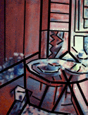
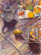
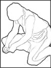
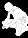
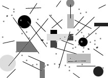
Illustration 1 - Leading the eye around and through the image (directional movement). (See original image above this one.) Heavy black lines indicate the main directions, or visual movement, in this image (as well as the primary linear structure/design in the image). Lighter black lines indicate secondary movements. This image contains curved and straight, and diagonal and vertical/horizontal directional lines; the opposing (down to right, down to left) diagonals balance one another, stabilizing the composition. The main structure of the painting is an upside-down Y shape, as shown by the heavy lines, starting at the top, going down through the chair, and dividing to the left and right, ending at the left side and bottom right corner, respectively. There is also repetition of curves, in the table top and dog's back. The ellipse of the table top is cut off at the right; its upper curve goes off the edge; the bottom curve brings the eye back into the painting. Note that on the left wall, even a change in value (dark and light) can form a directional movement.
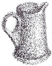
- Choose a small object, such as a 3-inch high pitcher, as shown below. With a black fine line marker, draw it in the Pointillist manner - that is, instead of using lines or solid tones, use a small mark, such as a dot, to draw the form. On the lighter areas of the pitcher, place the dots further apart, and in the shadow areas, place the dots closer together. Try to avoid placing dots around the entire contour (some can be left empty of dots, such as the lightest areas of the form). Where the rounded form (pitcher) is at its closest to you, try to accentuate the contrast of black and white to indicate the three-dimensional quality of the form. This exercise demonstrates use of values to indicate form, as well as the idea that three-dimensional form can be indicated with mass (as opposed to line) very well. The dots also form shapes in the image. This exercise also teaches patience - but it's fun to see the results. (You can sketch a rough outline of the object lightly in pencil before adding dots, if you wish.)
Specific Guidelines:
Horizontals and verticals tend to create a feeling of order and calm.
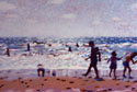
Symmetry means that left and right sides are identical, which in art can be not very challenging to the viewer. Try instead for asymmetrical balance, which means that the image can be balanced, without being identical. Here there are three large figures on the right (with the largest one toward the center), but the child and four swimmers on the left, plus the light-filled empty space, balance the composition.
Curves in this pastel move in circles around and through the image (and background), bringing the viewer's eye always back into it. The curving strokes in the "background" also direct the viewer's eye in this way.
Generally, the visual "weight" should be in the bottom half of the image, rather than be "top-heavy." There are many exceptions here, as elsewhere, however.
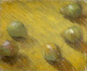
Many times, an odd number of forms is a better design than an even number, which is symmetrical. Here, there are four peaches plus a shell, to make five.
Instead of placing all of the forms in one area, the weight should generally be more equally distributed in the image.
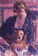
In this impressionistic pastel, the dog's face is the focal point (center of interest), because it is more clearly defined. And with the dog's black eyes and nose, contrast is created against the lighter part of his head, giving his head more prominence and making it come forward in space.
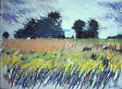
The many diagonal lines/movements in this pastel make it a more dynamic composition than one dominated by horizontals and verticals.
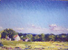
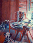
This oil painting is also impressionistically done, but here there is less of a focal point, and more of an overall feeling, which is more common to modern and contemporary images.
Directional Movement:
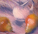
An example of shapes used in directional movement - the pears form a curve starting at the middle left, and curving down, to the right, and up to the upper righthand corner.
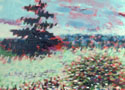
Line hatching as directional movement: In the sky, the diagonal pastel strokes are from top left to bottom right. In the flesh-colored field in the center, the strokes form a diagonal, from the top right to the bottom left. The bottom area of wildflowers continues the movement from top right to bottom left diagonally. The strokes in the whole image form a zigzag, from left to right at the top, and then from right to left on the bottom, like a > shape.
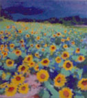
Here, the shapes of the sunflowers are used to delineate spatial depth, by getting smaller as they recede into the distance.
Above, values are used to lead the eye through the image, with smooth and abrupt transitions of light and dark.
In this painting, color is used to carry the eye through the painting. For example, the lilac blue of the tree starts at the lower left, goes up the left side and then moves right about 3/4 of the way; it then meets a color change of light colors, but links visually to the lower right corner.
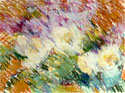
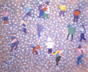
Here, the snowflakes are used to create a flat, all-over pattern, rather than to lead the eye in one particular direction. The children emphasize this flatness because they are all the same size, and are arranged in a circular two-dimensional pattern.
Van Gogh's ink drawings contain marks that serve to represent fields in the landscape; they also add texture to the works.
The French 19th century painter, Ingres, worked in the classical manner, that is, concerned more with line than with mass.
Monet, the French Impressionist painter, was concerned more with shape (mass) than with line. In this painting is an example of counterchange, meaning areas of dark on light, near areas of light on dark, as seen in the areas of the shadows on the ground (violet shadows on the sand ground). The Impressionists also were more interested in color than in value.
This Rembrandt self-portrait is more based on values (lights and darks) than with color. Also, it shows how the areas of the painting are not separated by hard contours, but that the forms are more "open" to one another, i.e., "flow into" one another easily.
In Cezanne's early work before he worked with the Impressionists, he used strong colors and contrasts, including the use of black. In Impressionism, black was not used as much as previously, because with the new flat picture surface of the Impressionists, black would tend to create a "hole" in the painting (go back in deep space).
In this modern painting by Jackson Pollock, the image seems to continue beyond the edges of the painting, rather than be contained by it.
In his painting, Renoir used color and light to unify the image, as did the other Impressionist painters.
Matisse was a 20th century painter who made use of pattern (and repetition) in his work. At the link page, click on State Hermitage Museum, St. Petersburg, Russia, 50 works, and go to painting numbers 17, 18 and 19 for good examples of his use of patterns.
In this etching by Morandi, he used cross-hatching - more than one layer of strokes, going in perpendicular directions.
The 20th century modernist, Paul Klee, used line often to lead the viewer's eye through the image, and to unify it.
Titian is an example of a traditional painter, an "Old Master." He worked in 16th century Italy, and was concerned with representational imagery, traditional illusory space, line, value, naturalistic color, and gradual shading and modeling of forms.
Jean-Michel Basquiat was a contemporary painter, who died at a young age. His work reflects the late 20th century "flat" and all-over space, lack of naturalism, interest in color over value, free personal expression and visual energy, and unexplored aesthetic territory.
Illustration 2: One example of Josef Albers' color exercises, designed to show how colors change depending on what colors and values surround them. Above, the color strip on the right is made to look like two different colors on the left. When done in paper rather than on a computer screen, the white strip is actually a piece of paper which can be lifted to show that the two colors are indeed the same. On the left, the color appears to be closer to red; on the right, it looks more orange. This is due to the fact that red and green are complementary colors, and the green will make the color look more red. Orange and blue are also complementary colors, so the blue will make the color on the right appear more orange. Values can also affect these relationships; the lighter green will make the red look darker, and the darker blue will make the "orange" look lighter.
In the above example, two different colors are made to appear like the same color. On the right, they are placed together so it can be seen that one is orange, one is red. Again, the white strip "hides" this fact. Using color and value, with experimentation, you can produce color effects such as these, and learn how colors interact with and change one another, as well as values (lights and darks). The best way to do this is to use artist-quality colored papers, such as Color-Aid paper, however Color-Aid paper is very expensive. I checked at www.dickblick.com, and found that a full set of Color-Aid paper is over $700 (as of the date of this writing). That's right, $700! They also had listed a swatch book, which is a full set of colors, only 2" x 4-1/2" size sheets, for $37.00, and I think a 6"x 9" set for $91. The smallest set could be used, if you work in miniature. Construction paper is of limited value in these exercises; what you need is colored paper which comes in as many colors as possible, to try different colors and values. "Found" papers can also be used, like from magazines, etc, or even autumn leaves. When painting, you can learn to see these effects in action, and learn to arrange your colors and values with this interaction in mind.
Illustration 3: Spatial cues - These are some of the spatial cues artists use to indicate spatial depth in images. These cues are used in both traditional and contemporary painting, although the manner in which they are used can differ between approaches. Traditional art tries to represent the illusion of distance; contemporary art (after 1850) often is not concerned with the illusion of depth, but rather the arrangement of forms on a flat picture surface.
Positive and negative space - The drawing on the left is a contour drawing of a form, in this case a figure. The center image is the drawing with an outline which indicates the delineation of the "negative," or empty, spaces around and inside the figure. The edges of the negative shapes include the outside edges of the paper; this illustrates the first part of the above exercise - drawing the negative spaces with line. The drawing on the right shows the negative space blackened, to illustrate the second part of the above exercise in negative space, with value (or tone) - light and dark. Being aware of the negative areas actually helps to see the object better, and to draw it more accurately; it also helps in seeing forms abstractly - not as we "know" they are, but how we actually "see" them.
Design IV: Pictorial Elements
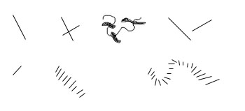
Illustration 4 - Directional movement and balance - Above are simplified examples of movement, countermovement, and balance. Above left: one diagonal line, moving from upper left to lower right (a movement); next to it is a similar line, with a line crossing it which goes in the opposite diagonal direction - this second line is a countermovement - it "stops" (or neutralizes) the visual movement of the first line, and in doing so, helps to balance the composition. Middle top: a curving line, which is a movement through the composition; it has little shapes "stopping" it at various points, balancing it. Above right: a diagonal line from upper left to lower right; the line in the opposite diagonal direction "neutralizes" and balances the first line. Lower left: A simple diagonal line, from upper right to lower left; next to it, a series of similar diagonal lines; this series of lines, although facing from upper right to lower left, forms a movement together from upper left to lower right in the composition. Lower right: A series of lines, mostly diagonal, together form a curving movement through the composition.
Illustration 5 - Balancing the compositional elements - Above, a simplified example of balancing a composition. Elements (lines, shapes, forms, figures, etc.) are introduced, and are then balanced in other parts of the picture. When elements form a directional movement, countermovements are then added to balance the composition. In painting, this process is continued until the image is complete, and is balanced in weights and directional movements, according to the artist's intentions.
Note: This page takes a little longer to load - please hang in there, there is some important stuff here!
View Jasper Johns' use of the 20th century grid structure in one of his early paintings.
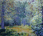
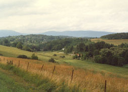
In the above photo, you can see that the faraway hills are a lighter value and cooler color (blue) than the closer (green) hills. This photo shows atmospheric perspective - indicating distance in a landscape without the use of mathematical linear perspective. Many artists, including the Impressionists, made use of this in their landscape paintings.
The collage was invented early in the 20th century by the Cubists and others, including by Picasso, Kurt Schwitters, and others.