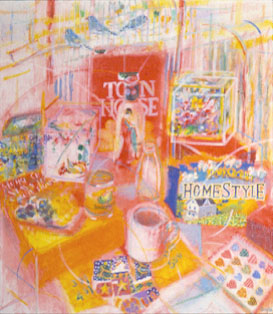
This is an original oil painting which I named Still Life. It is one of a number of similar still life paintings I've done since the first one in 1974. My original impulse for the still lifes came as a result of my interest in the work of Pierre Bonnard and in 15th and 16th century Persian miniature paintings. Both of these images are vertical, and they are both concerned with rich color and have a decorative and opulent quality, the opulence of sentiment. At first I painted this type of image every so often, usually based on a certain color scheme, such as red or blue, and more or less naturalistic in style. A few years ago, I began to paint these more often. I really like painting them, because they are full of visual and expressive possibilities for me. In a landscape, I feel I can only take certain liberties of color and form; with these still lifes I can literally put anything in the world in them - there are no limitations. I can juxtapose unexpected imagery, or add objects that are related in some way - by subject, color, form or expression.
The conception of the still life usually begins with a certain number of colors - in this case red, yellow, blue (the three primary colors), and white. (I also wanted touches of other pure colors, like red violet, green and orange.) Then I gather objects with these colors which also relate to one another visually - cubes, cylinders and spheres (boxes, cans and bottles), and 2-dimensional images (photos, wrapping paper, newspapers), and natural forms (leaves, shells, etc.) - and that together form the composition I want. (I am always collecting these things, for future paintings.) For this painting, I wanted a strong vertical movement, plus some diagonals and some arcs.
When I set up the still life in my studio, my birds (five finches) were on the other end of the table, so I decided to include them. (The vertical bars of their cages continued the vertical movement I wanted.) I include a lot of commercial packages in my still lifes - for many reasons, such as their shape and color; but also there is a tongue-in-cheek quality in my choices - a popcorn box, with pieces of popcorn for clouds, an Arizona iced tea bottle with an image of a Japanese woman in traditional dress, etc. I like objects that have more than one association, for example the iced tea bottle, besides being a commercial image, also refers to Japanese culture, which I regard highly. There is a part of me that likes to include things which are not considered 'high' art, like the grocery store weekly circular with its large $4.95 in green letters on yellow paper, or a piece of kitschy Christmas paper with snowmen, etc. This continues a long artistic tradition of calling attention to the small things in life that we see so often but we don't really see.
I include things also because I really want to paint them - they are irresistible to me, like the popcorn box. Painting pieces of popcorn in a blue sky was enjoyable for me, as well as the farm landscape on the box - house and cornfield. I just love adding all those colors in dabs and layers - call me a painter! I began the painting with a thin layer of red paint, blocking out the composition, and proceeded to add yellow in certain areas, which of course makes some areas orange. I work from larger areas to smaller areas. There are three different kinds of "white" in this image, none of which is pure white. One has a pink cast, one a blue cast and one a gray cast. Don't ask me WHY I paint these grocery items! Seriously, I use them because of their geometric shapes and their bright colors, as well as deadpan Pop Art. I also like the large text they have on them - the brand names and descriptions culled from marketing. To me they function as a kind-of concrete poetry - the words isolated from their commercial setting are often childlike, like "Mr. Salty" pretzels, or "homestyle." The artful marketing choices with the innocent-sounding language express something for me; as a person I view Madison Avenue mainly with contempt for their cynical exploitation of our emotions and needs, and often they are trying to sell us a harmful product. The combination of this terrible intention and the "innocence" they use to sell to us is one thing I think about when doing these still lifes.
I wanted a certain kind of visual space in this painting - a tension between traditional perspective space and a flat image. As I worked on the painting, the space seemed too three-dimensional; I kept feeling the need to flatten it. I finally got the idea to superimpose the geometric forms on some of the objects - just an outline of the cube or cylinder floating above and to the object's side, in white or other color. This flattened the image more. The arcs at various points served a similar purpose, as well as uniting the objects, which seemed too discrete. The painting overall has a solidity because of the strong horizontal and vertical movements, with only a few diagonals. The main compositional structure is a large diamond shape almost in the center of the composition, going almost to the edges, which also happens to be approximately the same area as the underpainted layer of red. The composition also is reminiscent of Cubist compositions, probably because I like analytical Cubism very much.